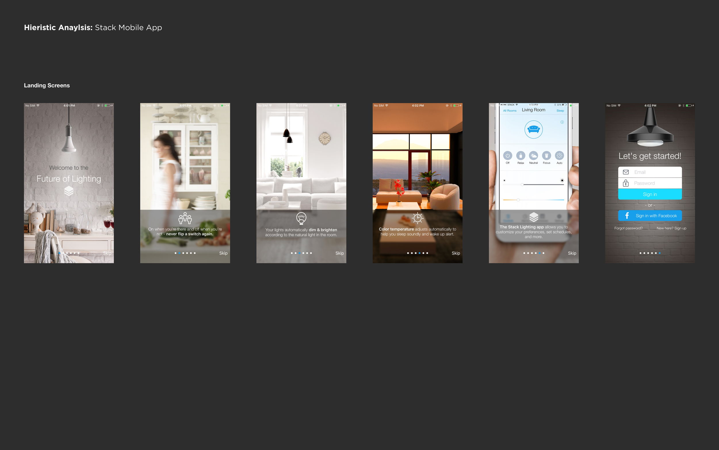
Stack lighting Use Case (2017)
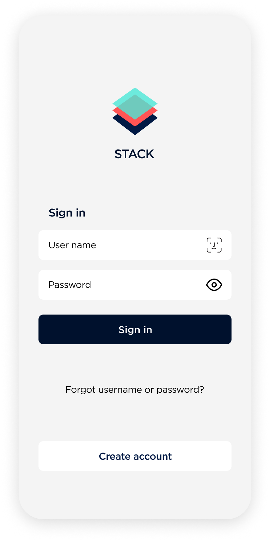
In 2017, I purchased Stack Lighting, an IoT product that allowed users to control their lights via a smartphone app. The standout features of Stack Lighting were its auto-adjustment of hue throughout the day to mitigate the disruption of the user's circadian rhythm and its Home Aware feature. The Home Aware feature utilized a combination of motion and infrared sensors built into the bulbs to enable users to monitor the occupants within the home.
Although the lights were easy to install, I found the mobile app to be less intuitive. While I enjoyed using the product, I felt that the user experience could be greatly improved. As a result, I embarked on a 10-day case study to improve the overall experience of the product.
Case study objectives
Propose a new conceptual model for the app.
Address usability and information architecture issues to improve overall usability.
Enhance the on-boarding experience through the use of an assistive layer.
Develop a unique visual system/branding to support and reinforce the new conceptual model.


Unintuitive conceptual model
The UI elements on the screen had limited affordances and labeling, which made it difficult for users to discover features and understand the conceptual model. The emphasis on achieving a clean UI resulted in reduced usability of this otherwise simple app.
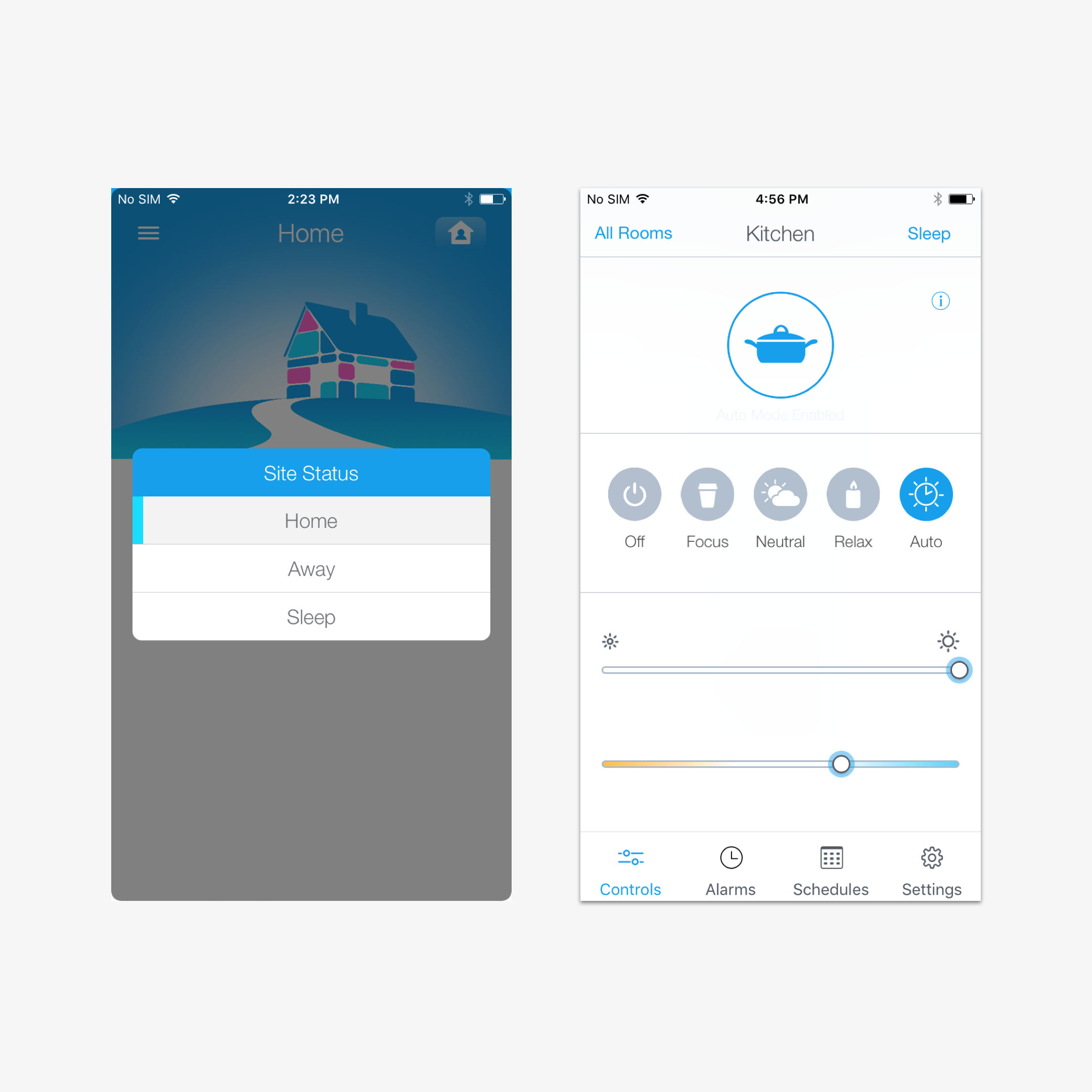
System status conflicts
The system status feature in the app was confusing as it could be changed from both the home screen and the individual room screens, leading to unintended confusion. This was because changes made to the system status were applied globally, meaning that setting a sleep status in one room would be applied to the system across all rooms.
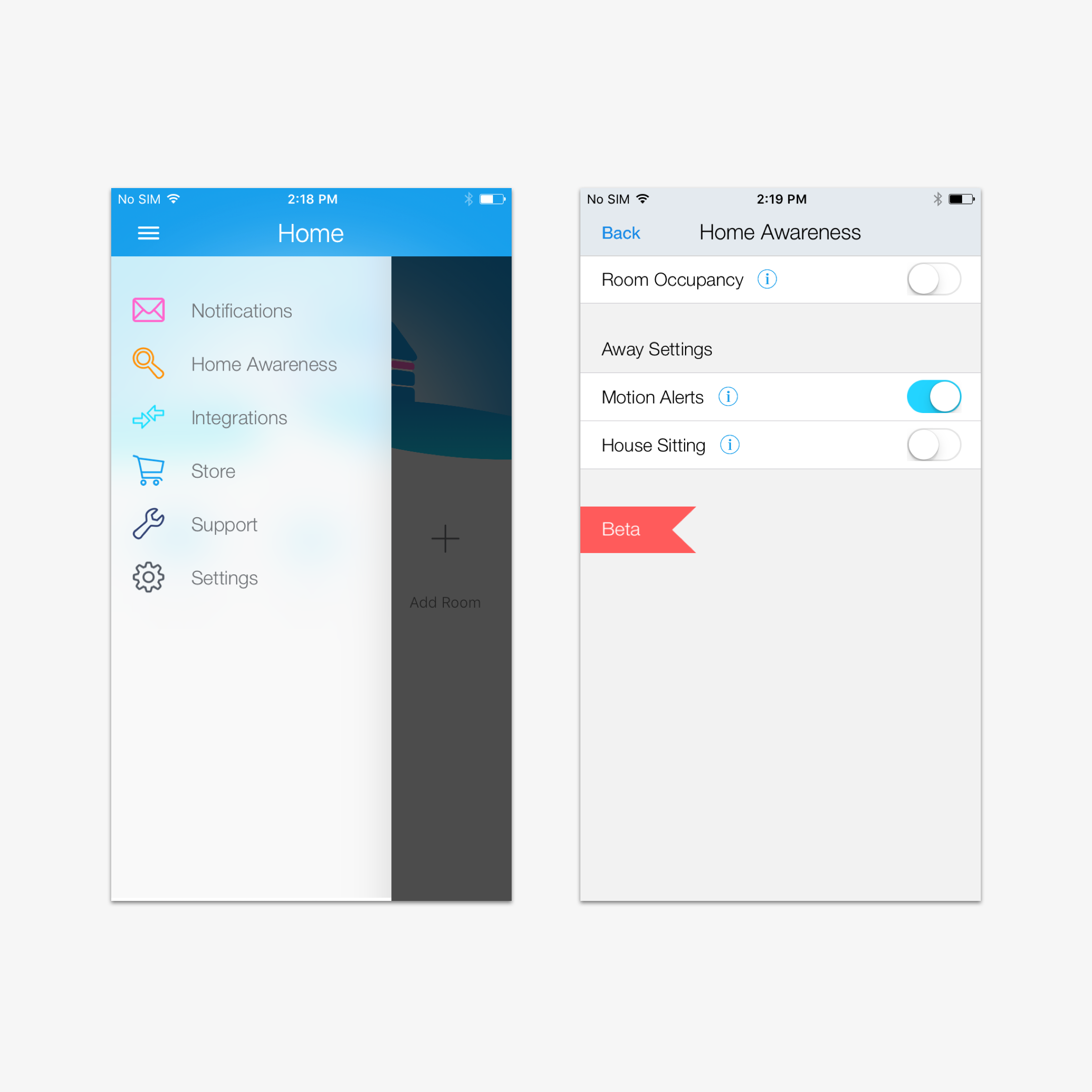

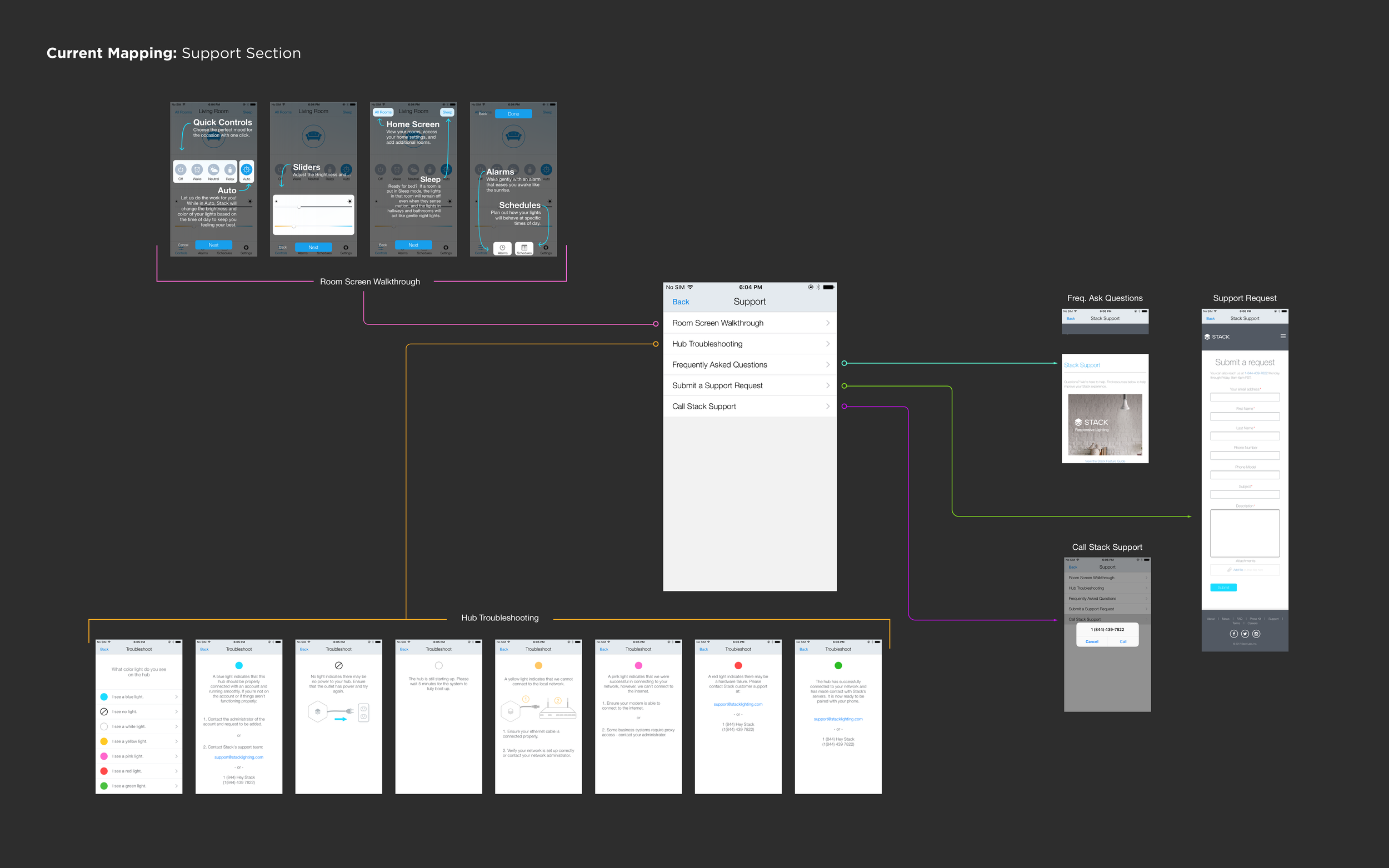
Poor integration of the home awareness feature
The Home Awareness feature, which tracked room occupancy using motion and infrared sensors in the bulbs, was communicated to the user through a push notification that directed them to a dedicated notification area in the off-canvas navigation. However, this indirect communication method created unnecessary cognitive load for the user, and the feature could have been more effectively integrated into the app for a more direct and streamlined experience.
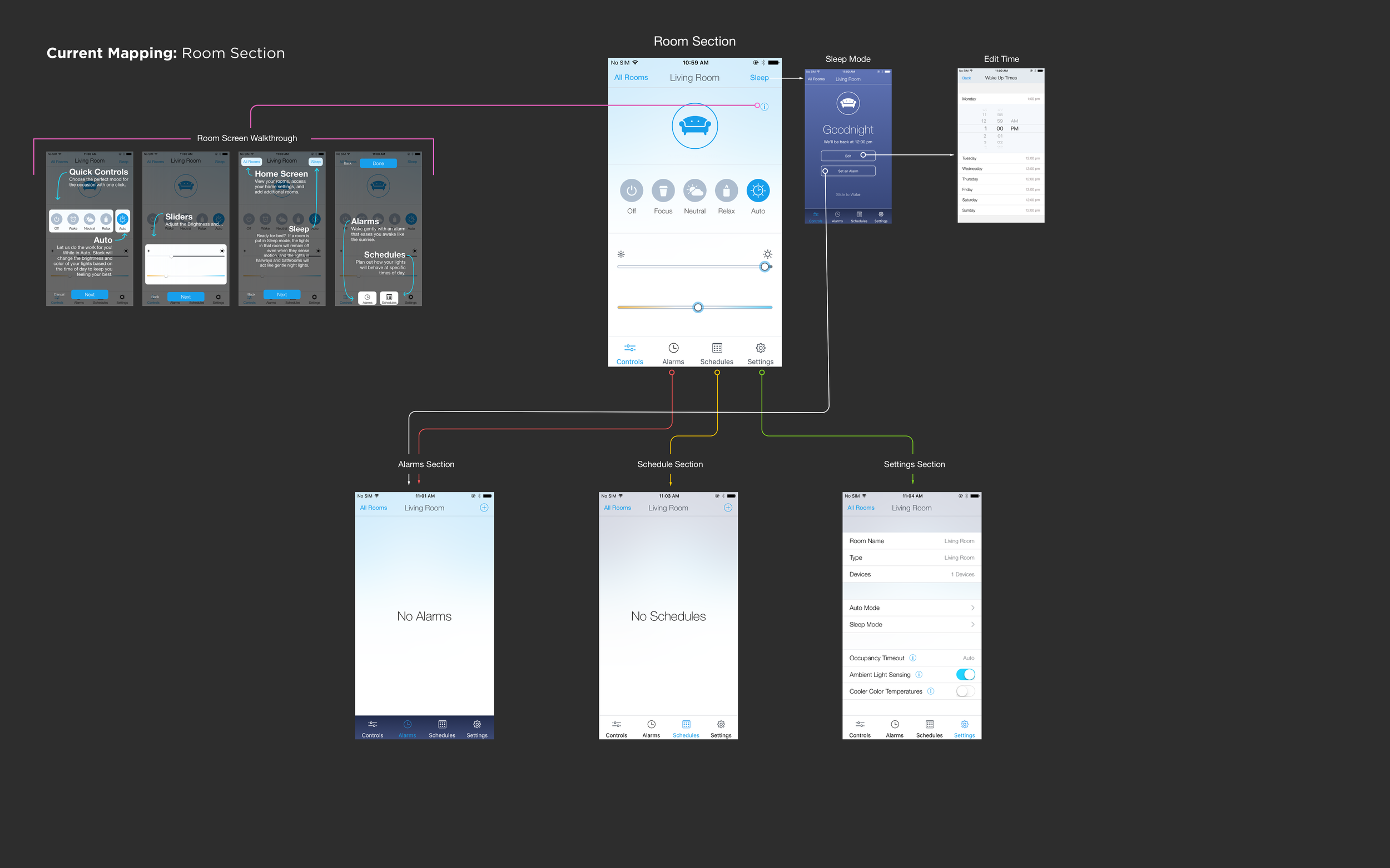
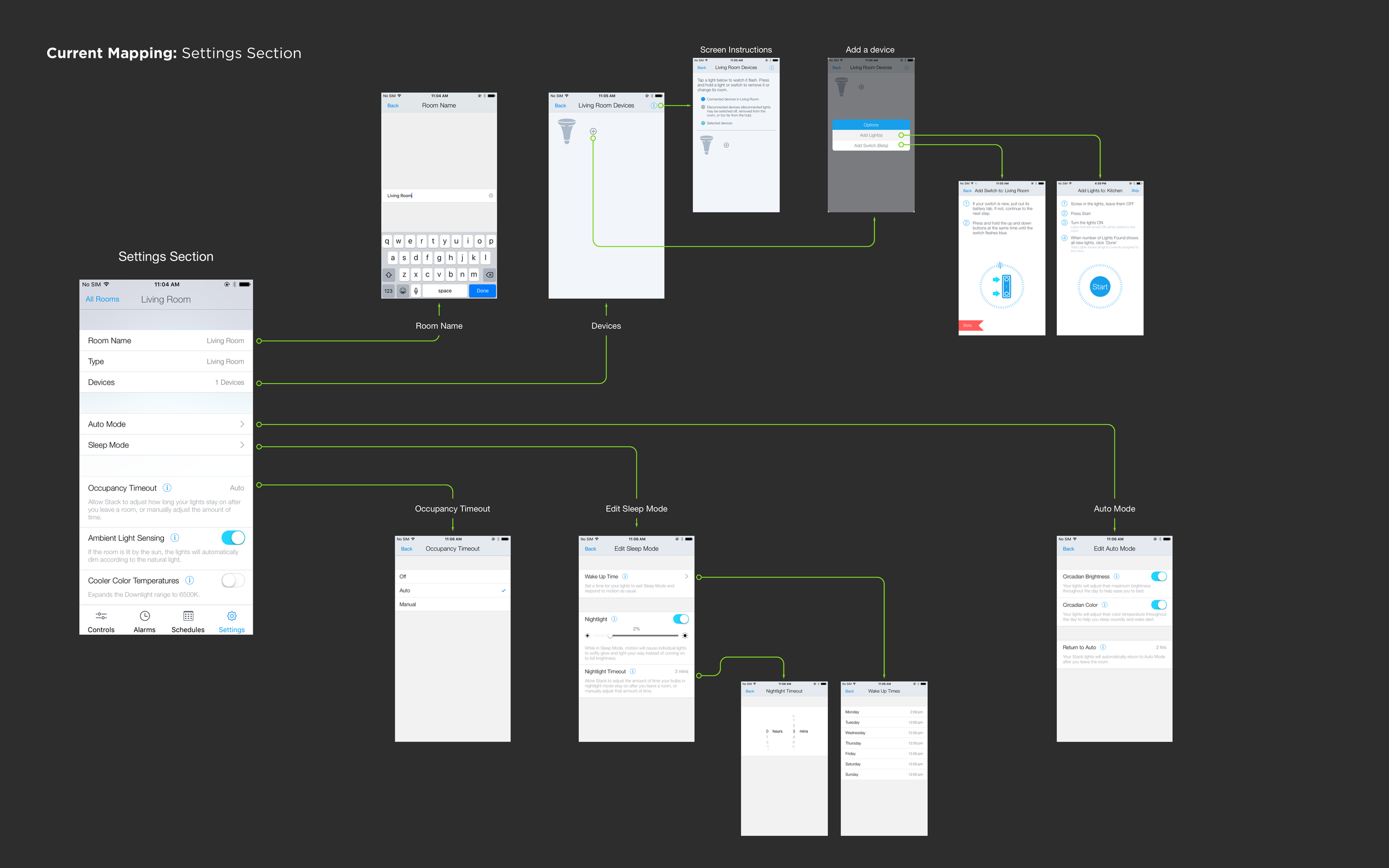
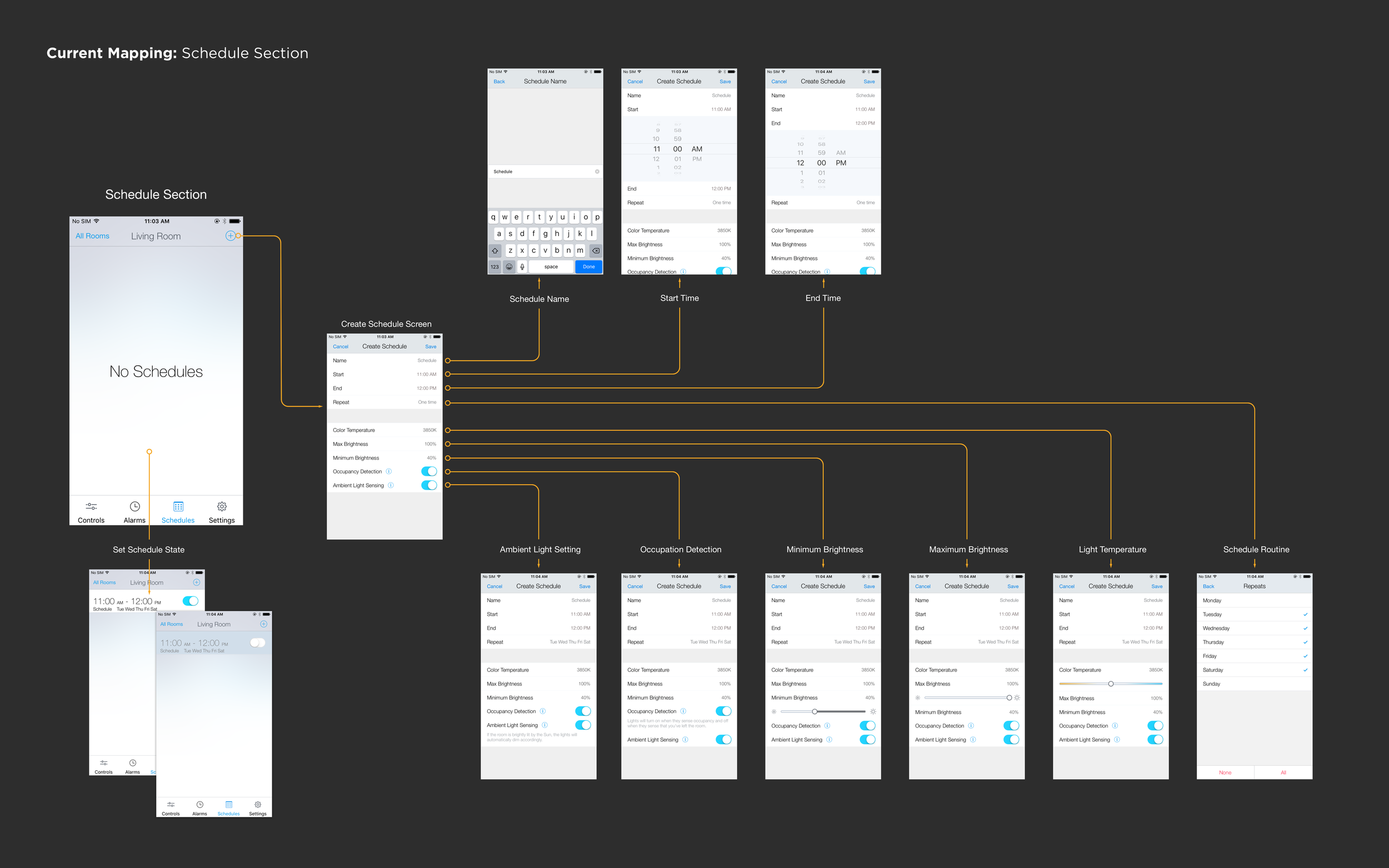
Information architecture issues for rooms settings
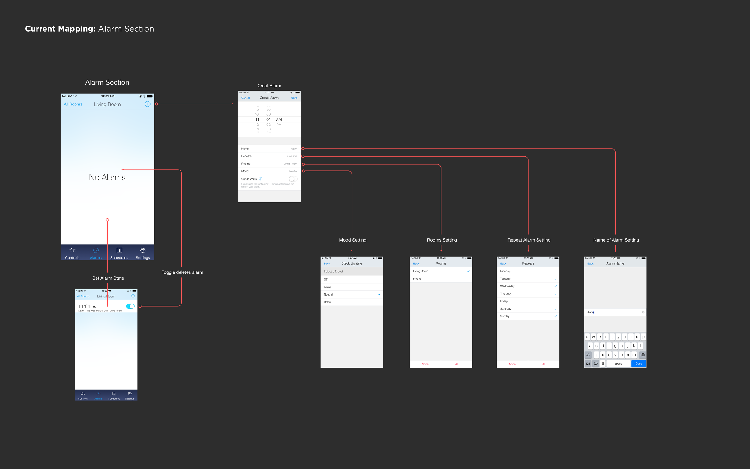
The room settings page suffered from complexity due to duplication of similar features, improper grouping, and ineffective mapping. Alarms and schedules, in particular, added unnecessary complexity, and could be better suited as their own feature, rather than being tethered to a specific room. As alarms and schedules are added per room, managing them becomes overly complex.
Conceptual model & visual language
Conceptual model rational.
When it comes to home lighting systems, the function has traditionally been straightforward - lights are turned on or off via a switch. However, with the advent of smart light solutions, controlling lights via a mobile app has become the norm. Yet, this approach can add unnecessary complexity, making the experience more convoluted than it needs to be.
To address this issue, my conceptual model for this design aims to create a status and monitoring driven experience, where constant engagement is not required. In this approach, I believe the best experience for an intelligent light system is one that is simple and intuitive. Here are some of the reasons why I believe this to be the case:
Adding unnecessary complexity is unavoidable when simplifying the classic experience of turning off or on a light via a switch.
Users typically have a static light setup in their home and changing this behavior is unnecessary.
The primary value proposition of most IoT lights is energy efficiency.
The circadian rhythm feature, which adjusts the lights' hue throughout the day, is optional and once set, most users don't typically change it. This feature isn't a critical value add.
To establish the expectation of a monitoring and static experience, the conceptual model drew inspiration from existing mental models such as architecture floor plans and dashboards.
Current home screen pain points:
Provide an intuitive way to control lights via the mobile app.
Ensure easy access to a room's light settings.
Clearly indicate the system status to the user.
Make the home awareness feature easy to access and understand.
Optimize the information architecture of the app.
Simplify the room settings to reduce complexity.
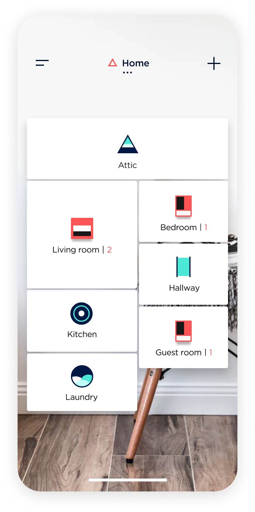
Room functionality changes
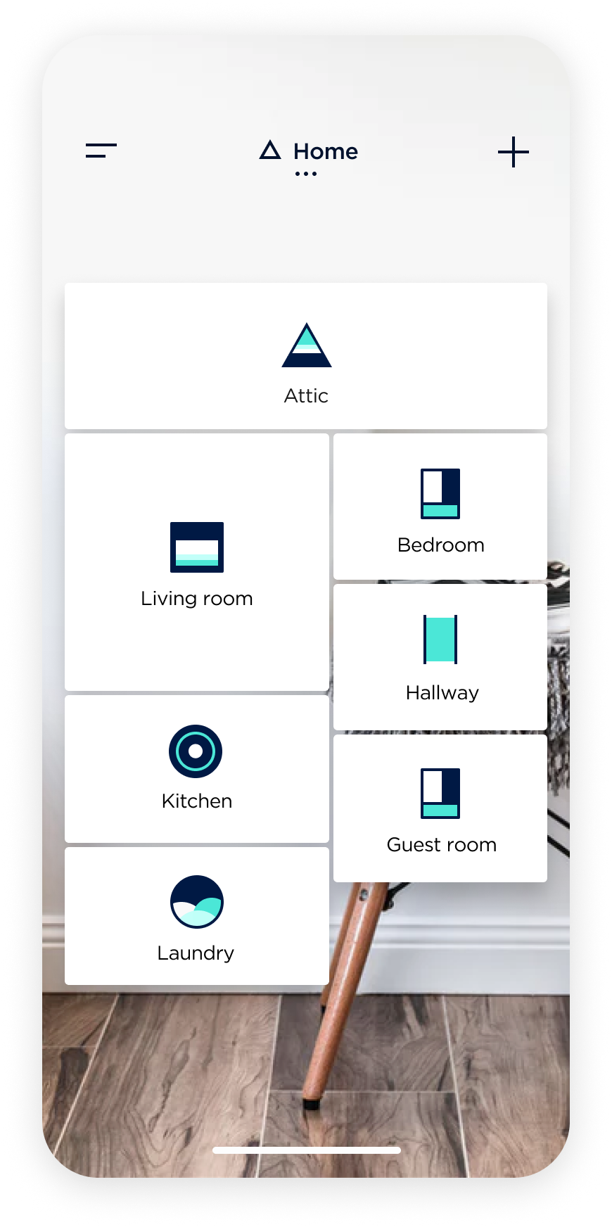
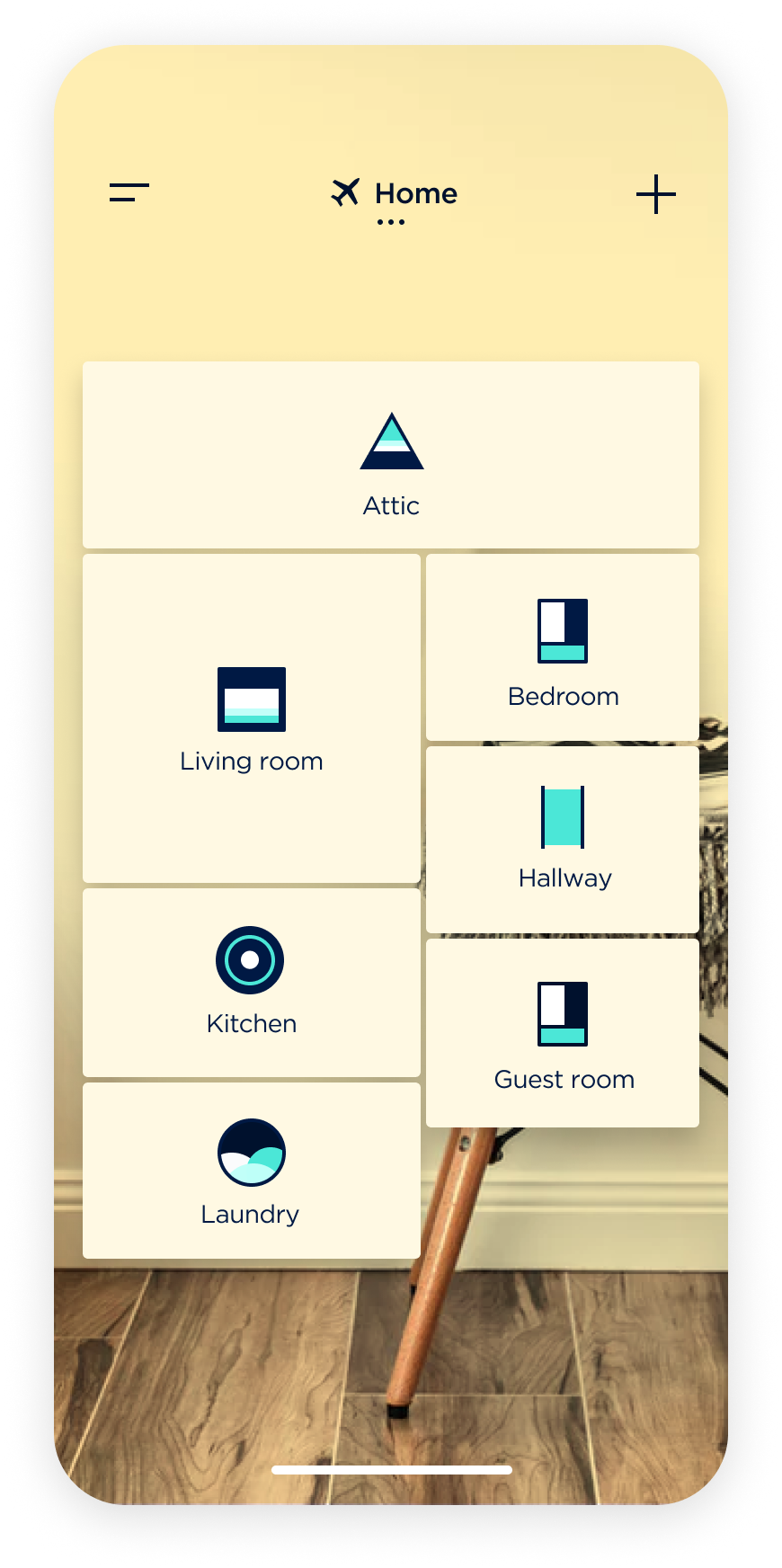
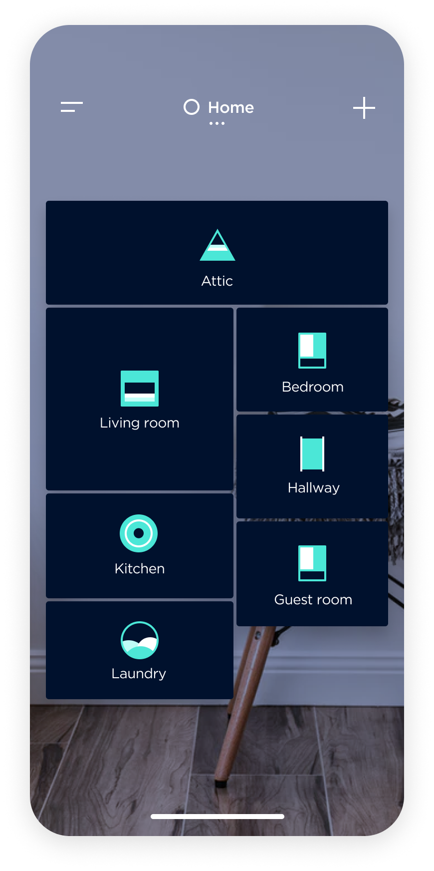
The previous home screen layout utilized icon-buttons to represent rooms and allowed for toggling lights on or off with a tap, and accessing room light settings with a long press. However, this approach created an issue with user expectations and poor discoverability for important features.
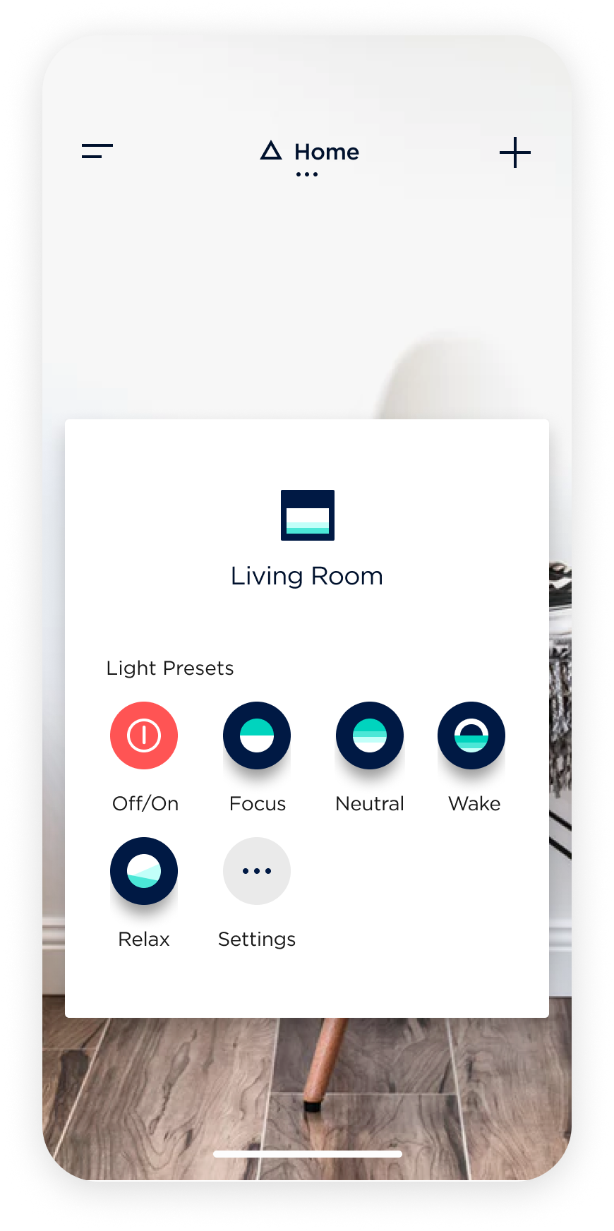
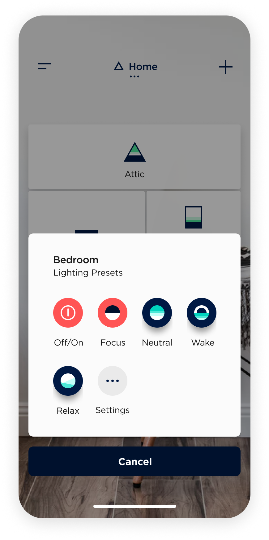
The new design approach removes the room icons and presents rooms as modules in a blueprint-style layout. Tapping on a module now reveals the room presets and settings, previously housed in a separate settings screen. Presets can now be toggled on or off via a toggle interaction, removing the ability for users to directly turn lights on or off. This new approach sets the expectation for a monitoring experience and improves discoverability by removing the force touch interaction and presenting presets and settings with a tap.
System status changes
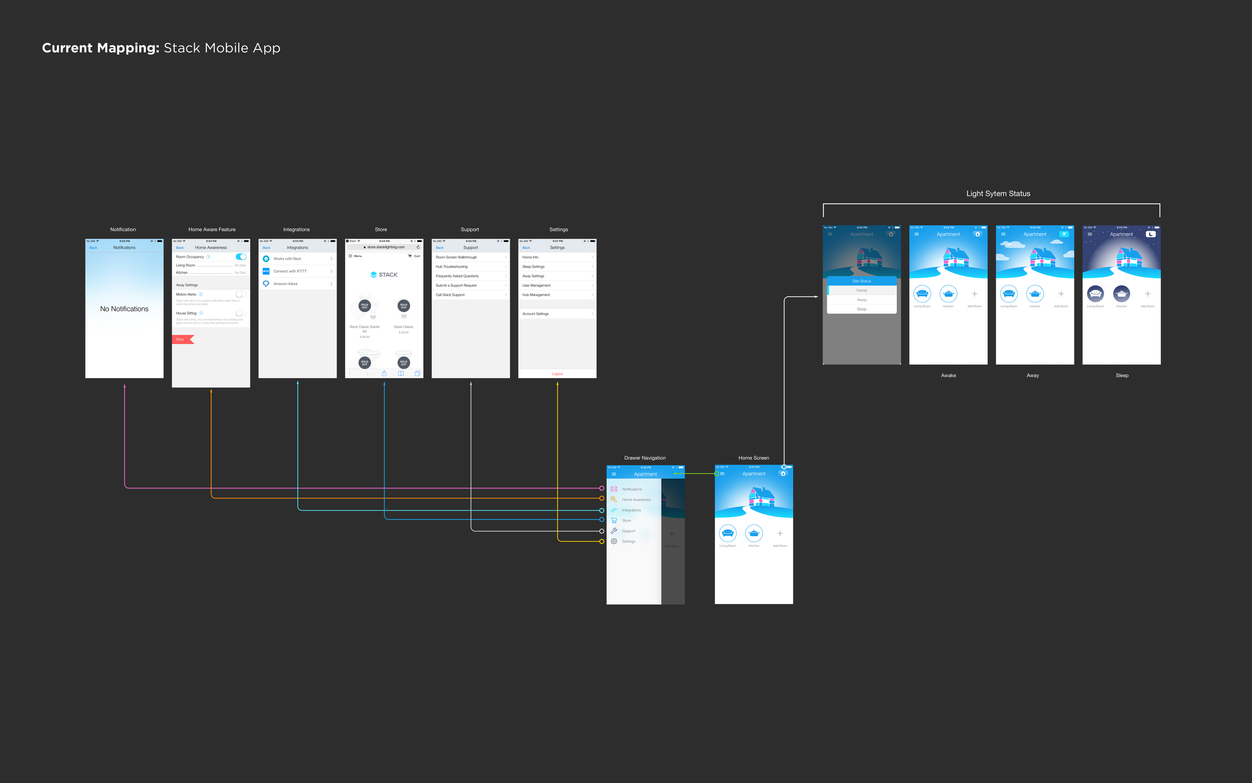
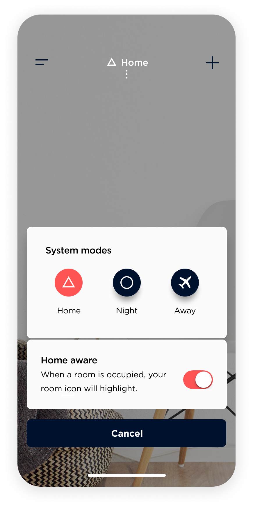
In the previous design, there was no clear way to know the system status or to receive feedback when a particular mode was set. In the new design, the system status is always visible at the top of the home screen, providing clear and persistent feedback to the user. Tapping on the status opens an actions menu that displays the three system modes (home, night, away) with accompanying icons and labels. To improve the discoverability and learnability of these modes, an info icon is placed below them. Tapping the info icon provides a quick synopsis of the modes without taking the user out of context.
Home aware coupled within system status
The home aware feature has been integrated with the system status modes for global impact on the system by tracking room occupancy. Users can access the home aware feature through the system status entry point, which was previously hidden in the settings screen. The new design also highlights the status of home aware through the occupancy number displayed in the room icon, which is accompanied by a color shift. This enhancement improves the overall discoverability and accessibility of the home aware feature.
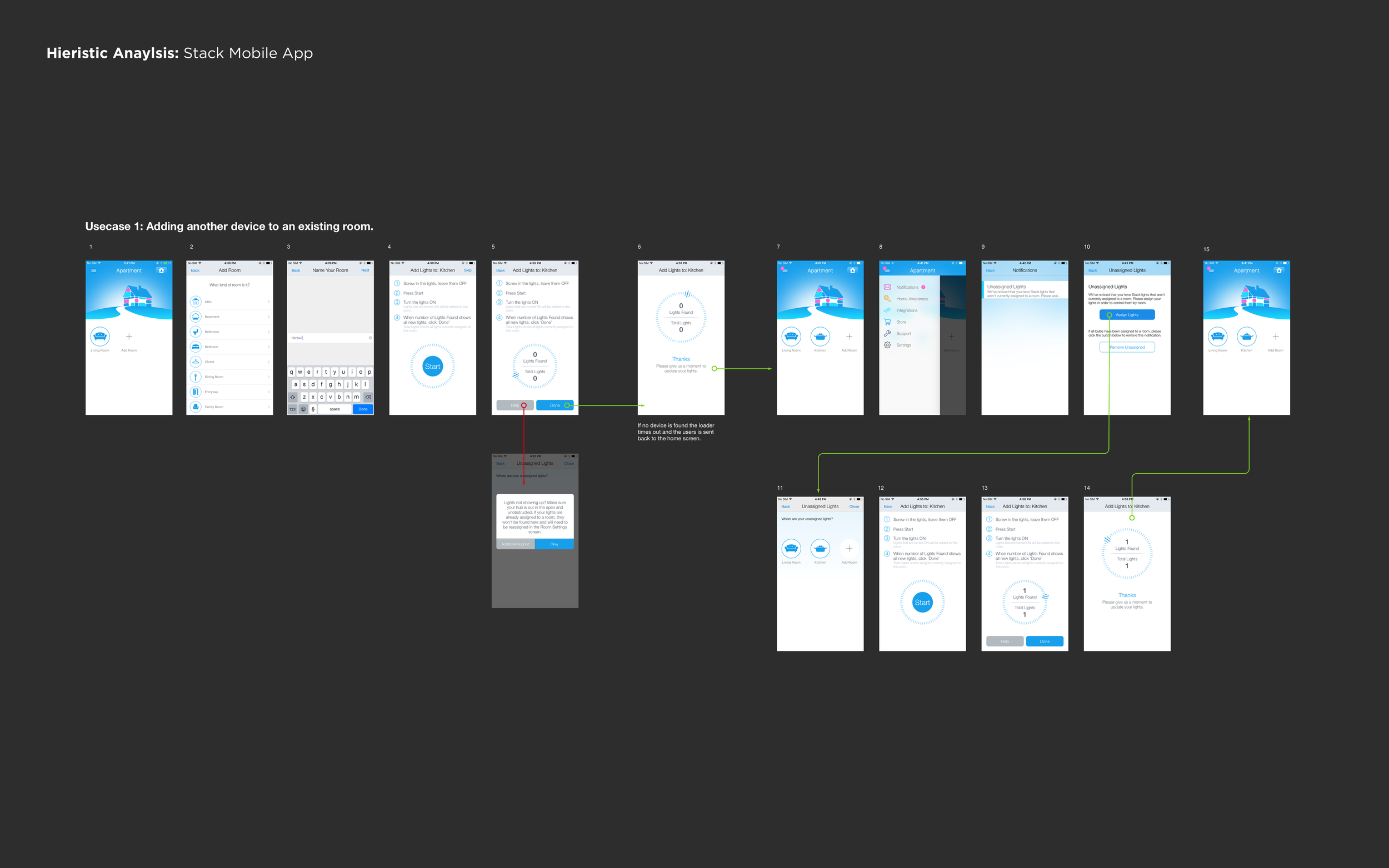
Adding lights and customize background
The home screen now includes a plus icon in the upper right corner that reveals options to add a light or a custom background. When selecting "add a light," users are guided through a setup process for the light and the room. Additionally, users have the option to personalize the app by selecting a custom background image of their home. In the future, the app could use location-based information to intelligently surface relevant background images based on the mobile device's position within the house.
Room settings redesign
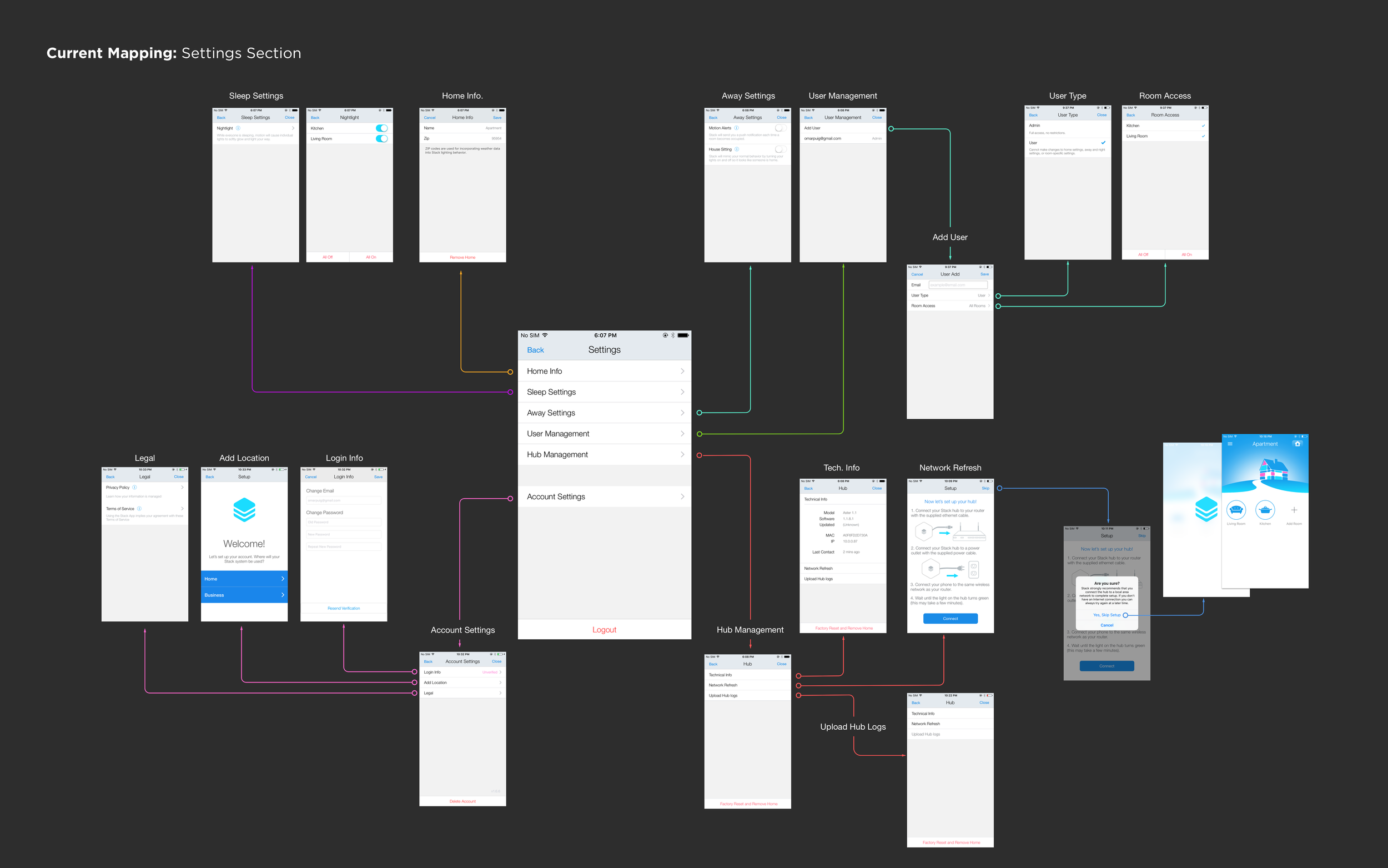
Taxonomy of the room settings screen
The original room settings screen had a contextual navigation bar with multiple options, including controls, alarms, schedules, and further settings. However, the information architecture was overly complex and challenging to navigate.
Information architecture improvements:
The "Off" mode was removed to maintain the existing paradigm of using the room light switch as the primary control.
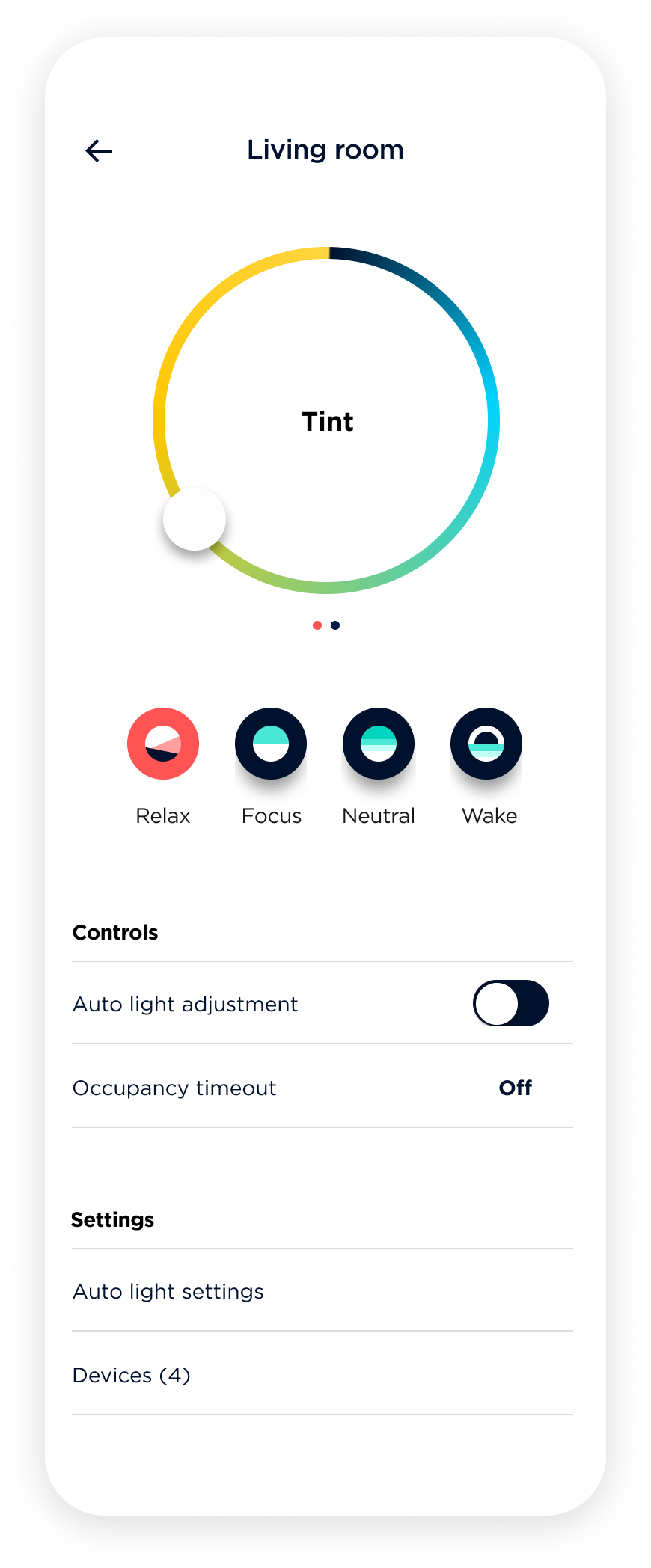
Presets and settings entry point are now surfaced via an action menu, simplifying the experience. Using a toggle control for presets has also simplified the interaction.
Moving schedules and alarms to the drawer navigation has improved accessibility and simplified the room settings.
Room settings have been reduced to preset adjustment controls, auto light adjustment, timer, devices, and auto light settings.
Drawer navigation redesign
The navigation options in the drawer were reorganized to improve usability. The taxonomy now includes locations, schedule (which now combines alarms), integration, settings (app settings), support, and login. To make it easier for users to understand where they are within the app, a signpost displaying their current location is now visible.
Further thoughts on schedule and its placement
During the 8-day case study, the "Schedule" feature was prioritized for quick access, as it is a feature that users are likely to engage with and manage. In the previous design, users had to access individual rooms to manage set schedules or alarms, which was not a user-friendly experience. Therefore, having a single entry point to access all rooms collectively was critical for simplifying the experience. However, due to time constraints, further exploration is needed to make schedules and alarms more effective. While the concept of setting up routines for devices using a schedule is useful, it is still complex, and more work is required to streamline and improve the concept. Alternatively, it may be necessary to abandon the idea of a schedule altogether.
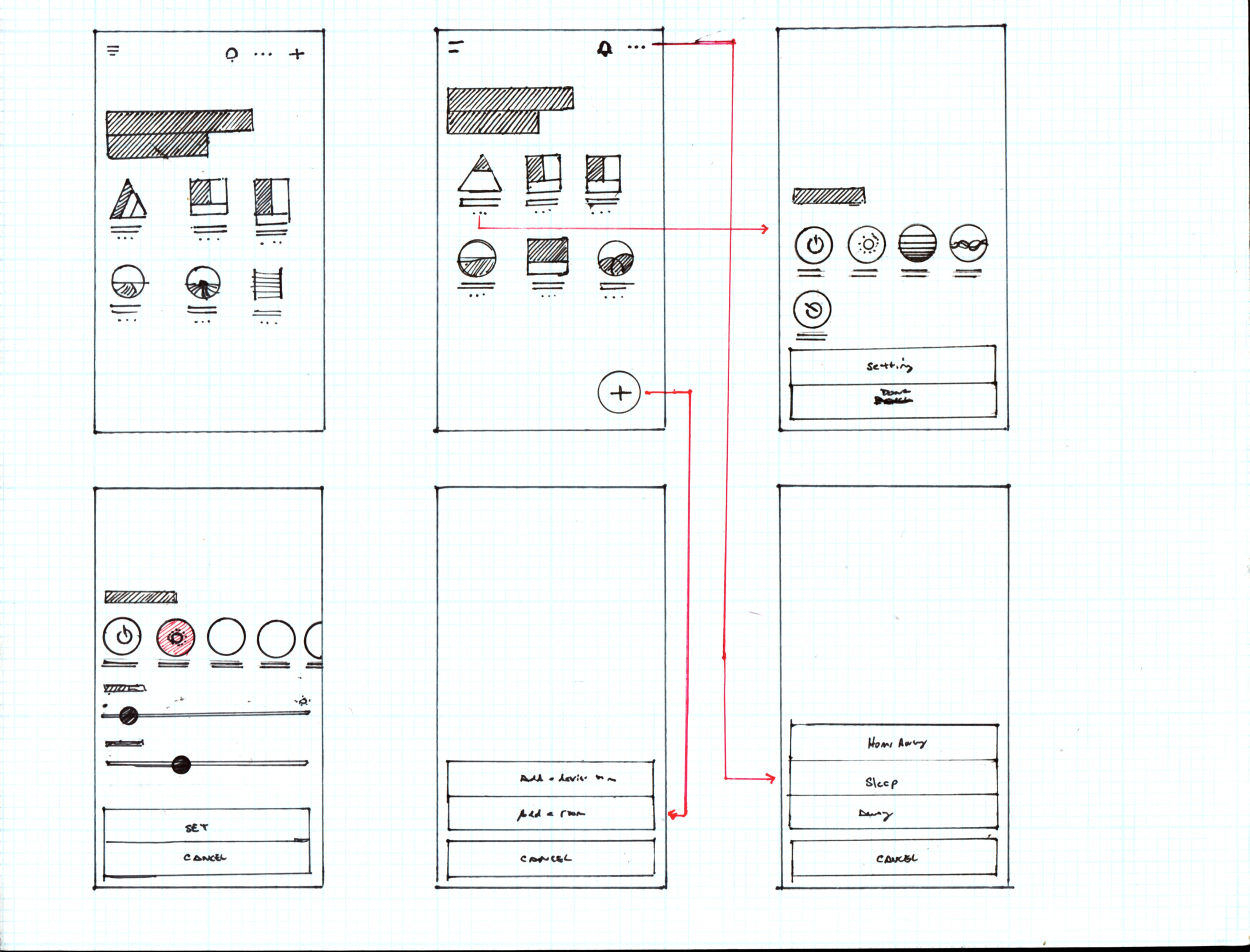
Sketches when developing new conceptual model.


Iconography sketches


Final Prototypes SCREENS
In the initial production of this case study, I used Framer JS to create a prototype that demonstrated the redesigned experience. The following screens were developed to showcase the proposed changes. Furthermore, I also designed a setup flow to accompany this case study. Currently, I intend to recreate this case study using Swift UI.

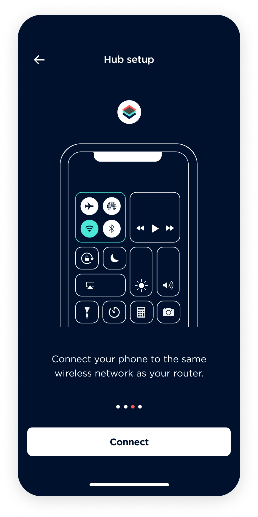
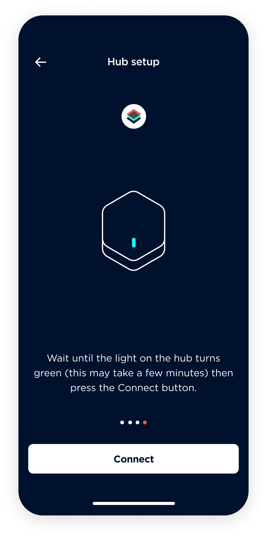
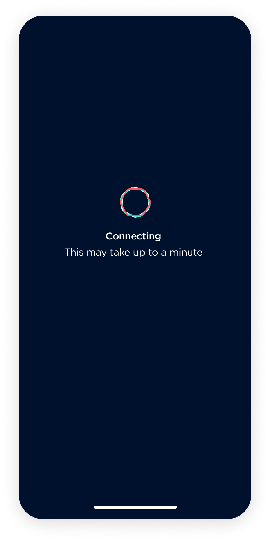
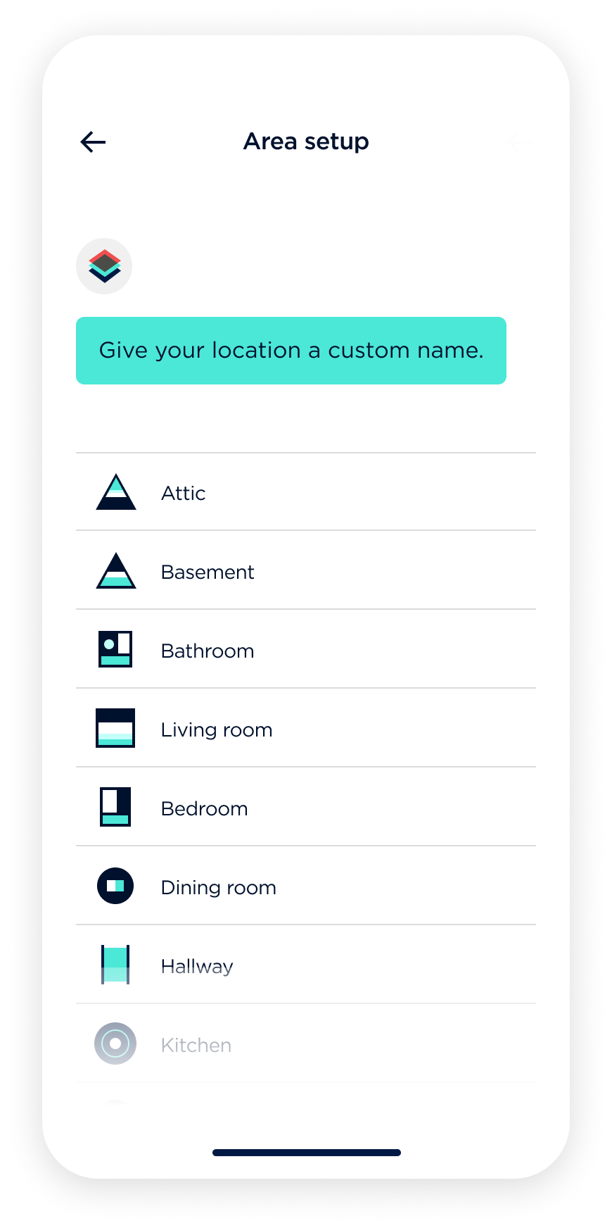
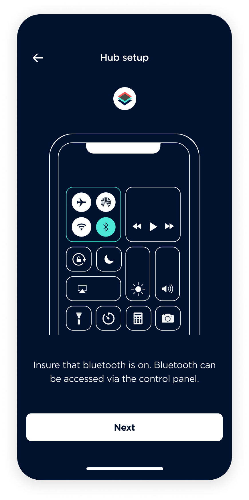
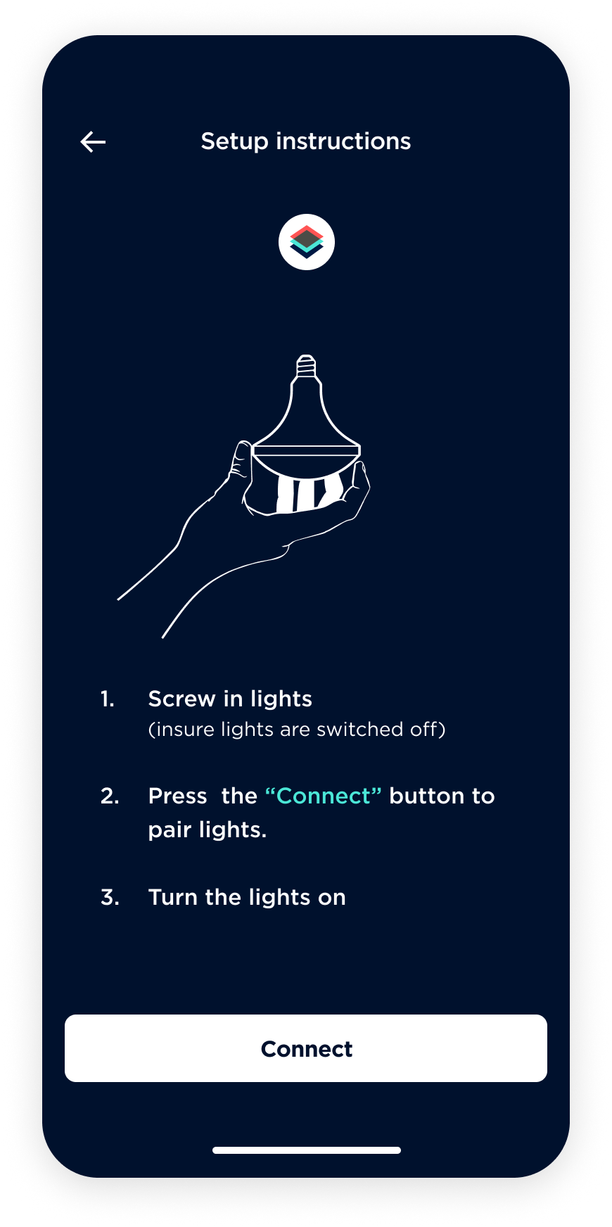
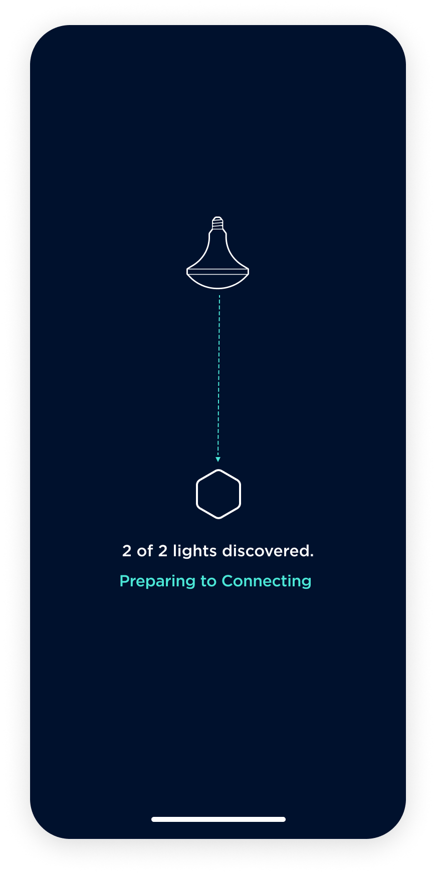
Setup workflow
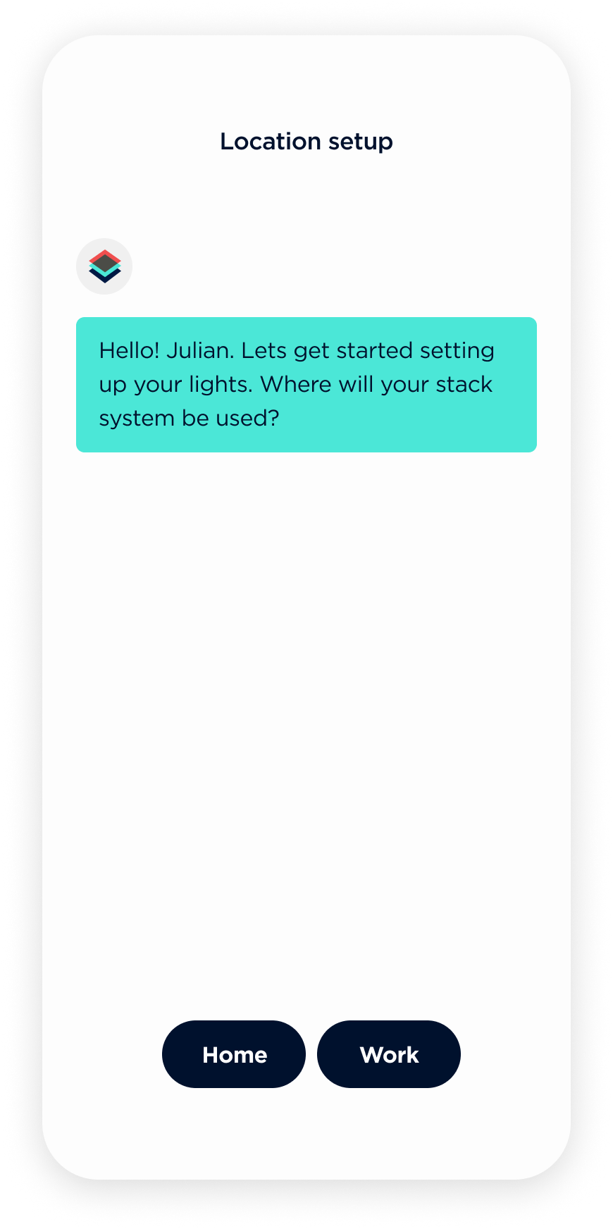
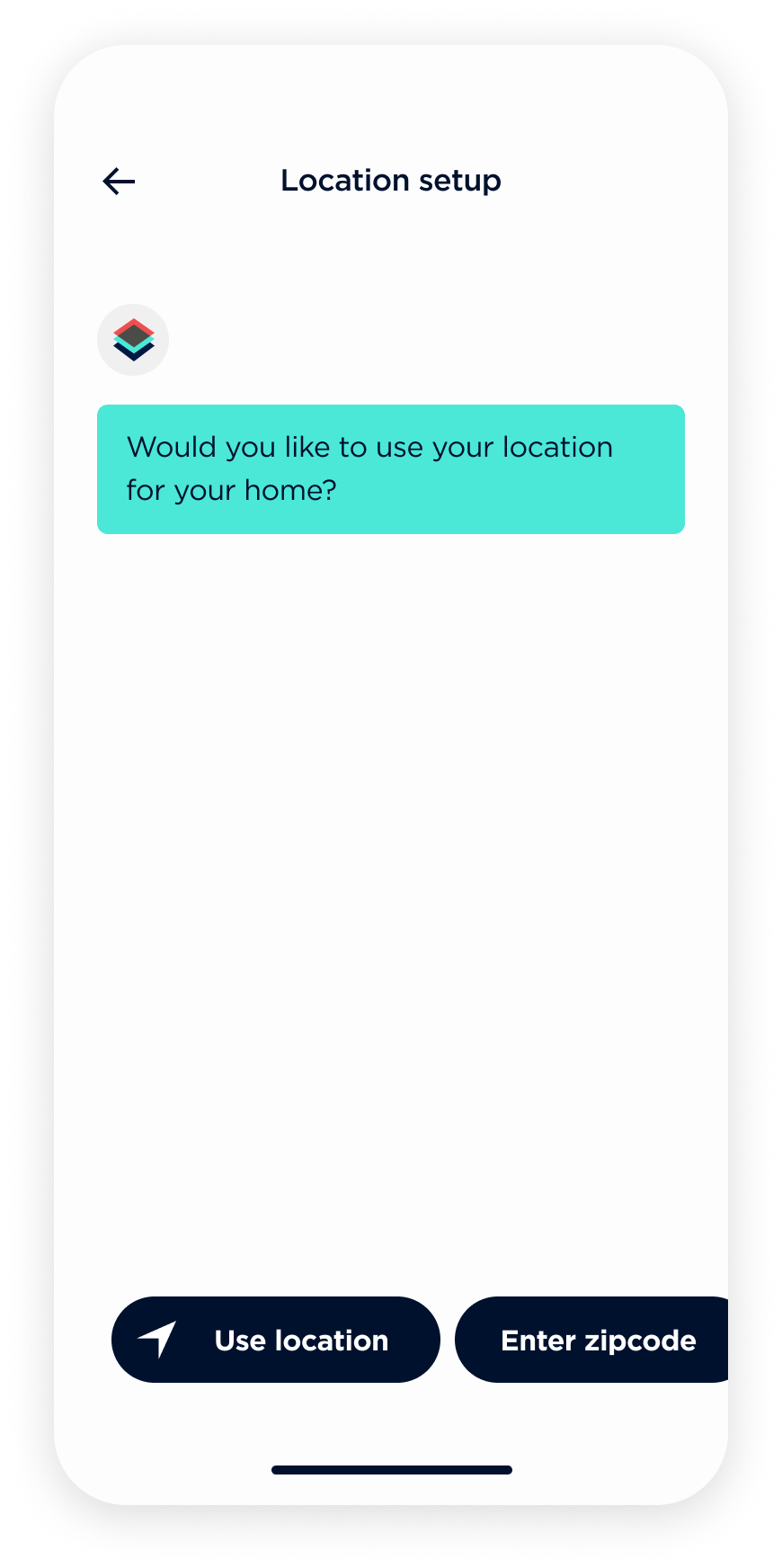
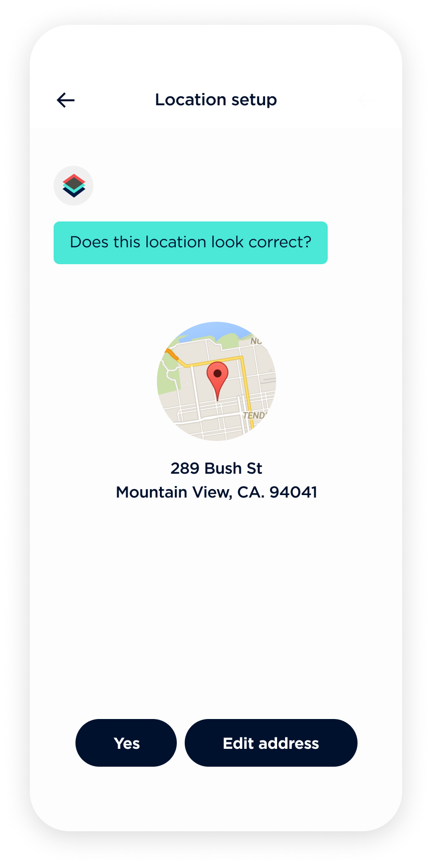
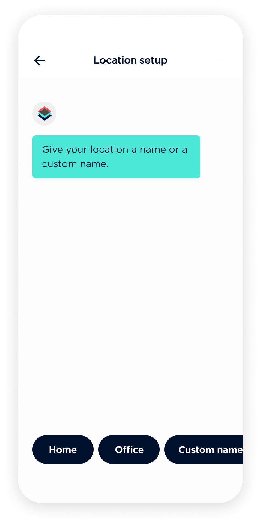
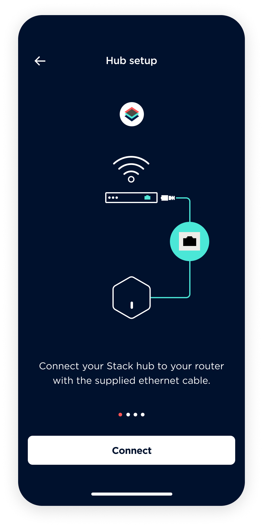
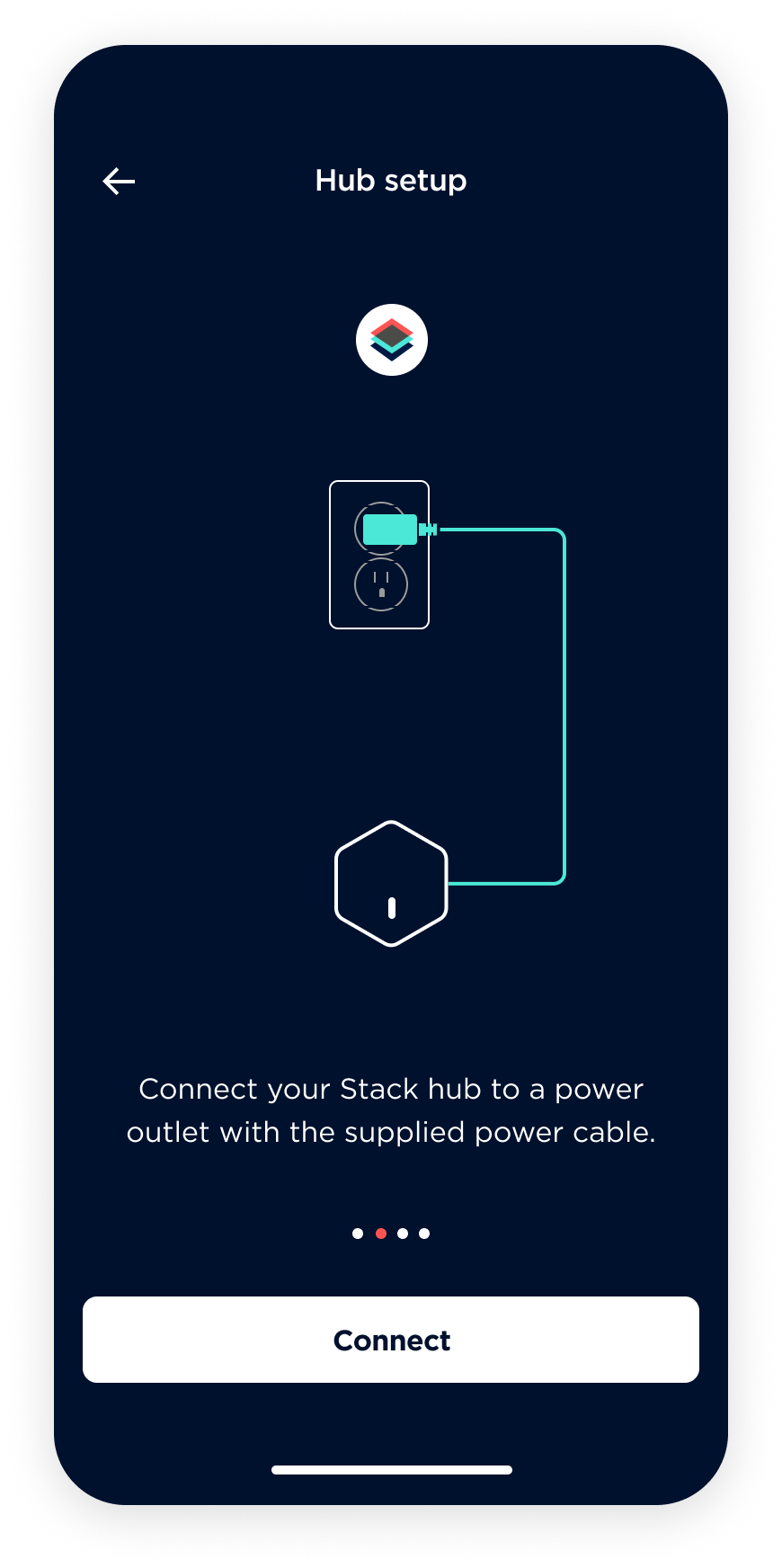
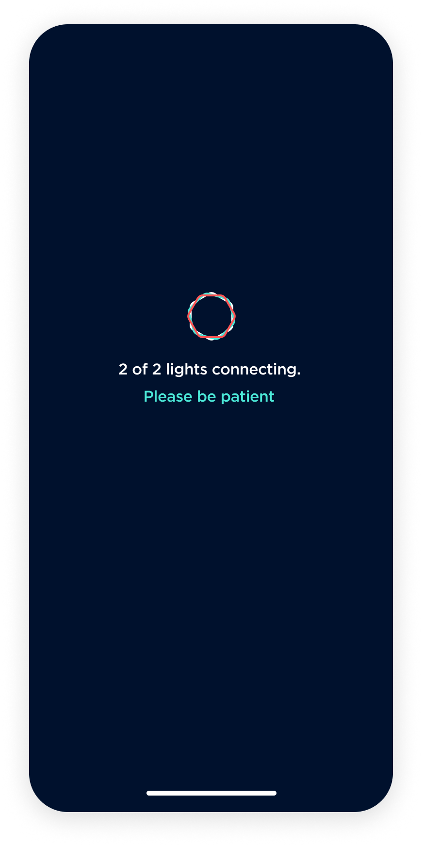
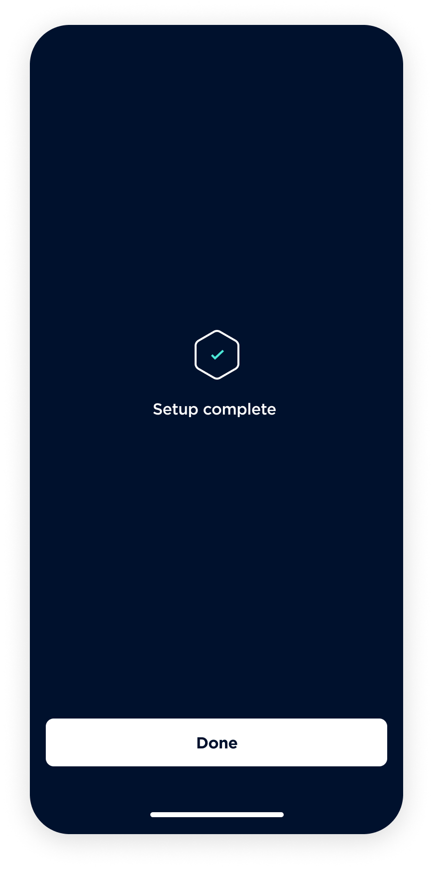
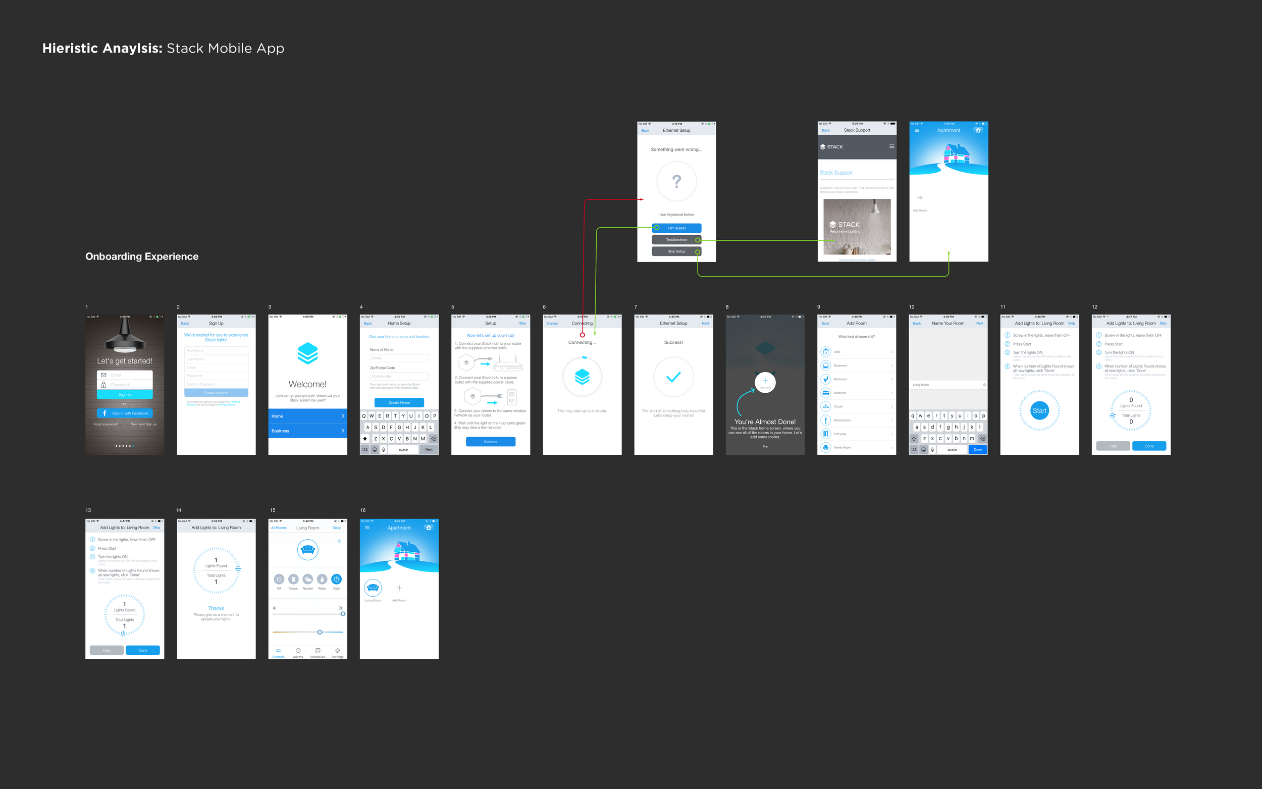
Apart from redesigning the Stack lighting app, I also reimagined the entire hardware setup workflow. To enhance the user experience and add an element of fun during onboarding, I opted for a chatbot-based approach.
The onboarding process can be divided into the following steps:
Location configuration
Stack hub setup
Light setup
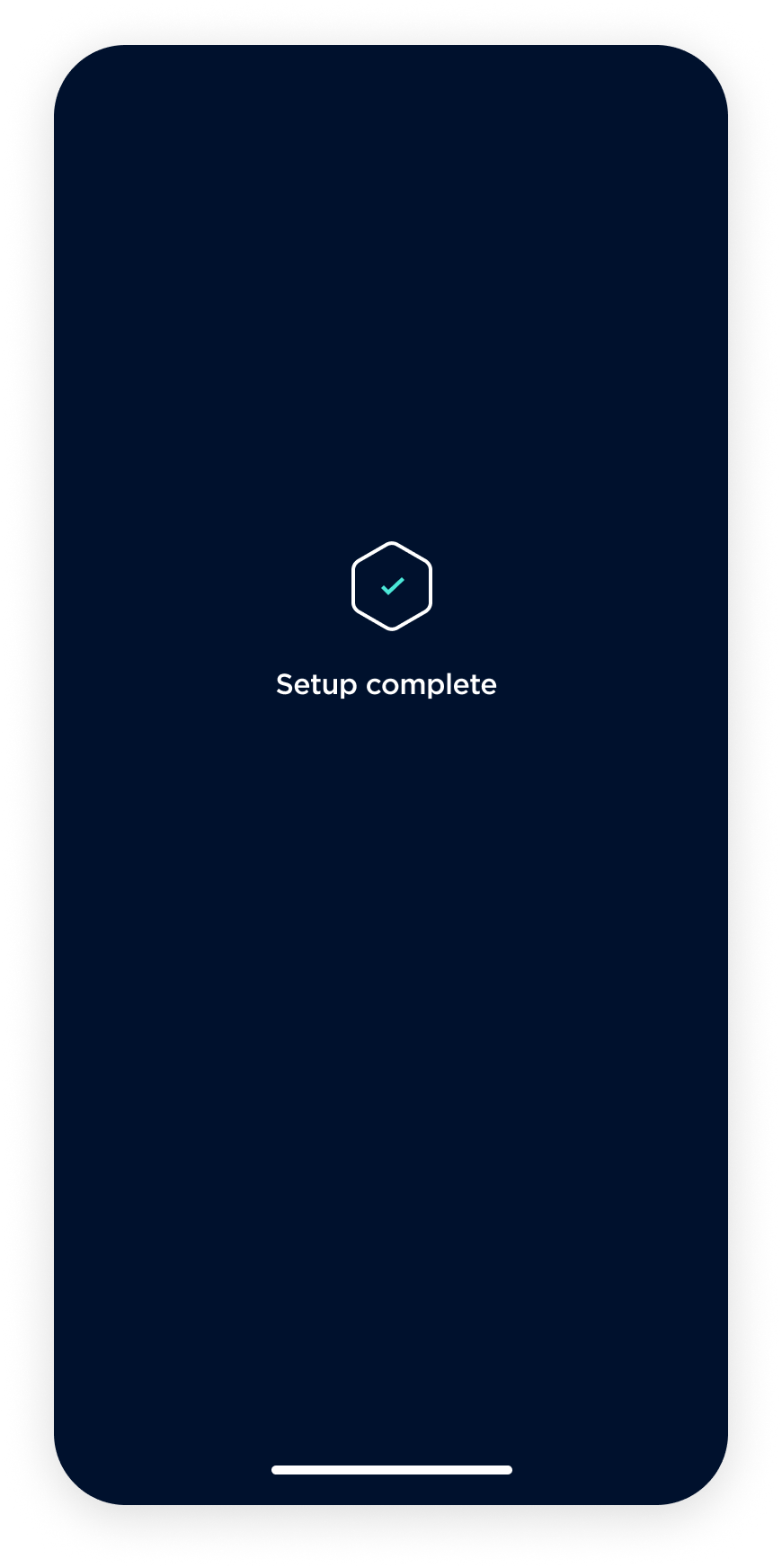
The hardware setup workflow has been redesigned to include a chatbot onboarding approach, aimed at improving the overall experience and adding an element of delight to the process. The user is assumed to have already created an account and is directed to the chatbot onboarding process upon logging in. The chatbot, represented by the Stack logo, asks a series of questions with canned responses to quickly capture the necessary data from the user. The chatbot then guides the user through the hardware setup process, concluding with the user arriving at the app home screen.