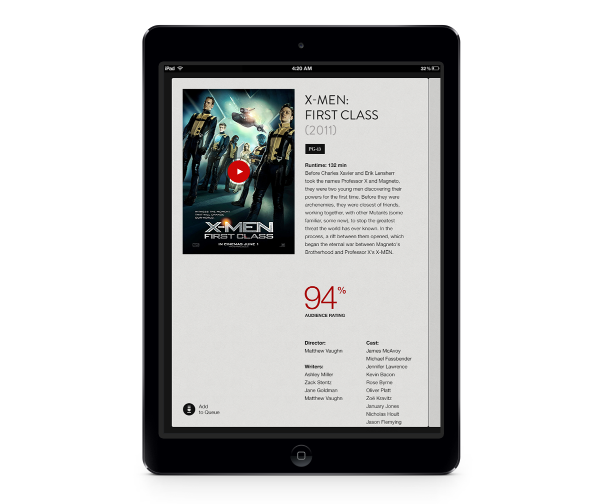
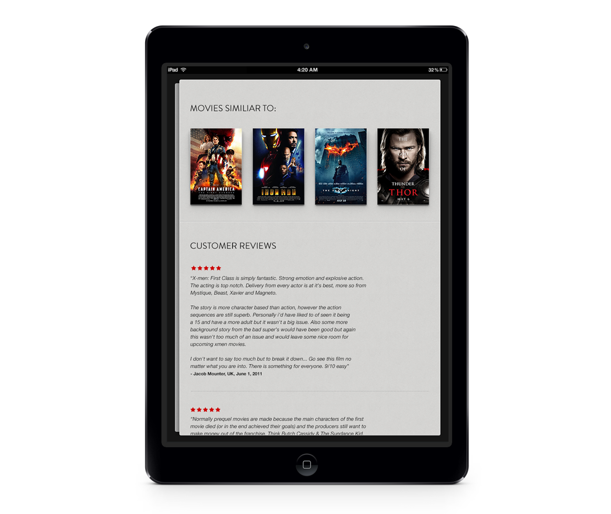
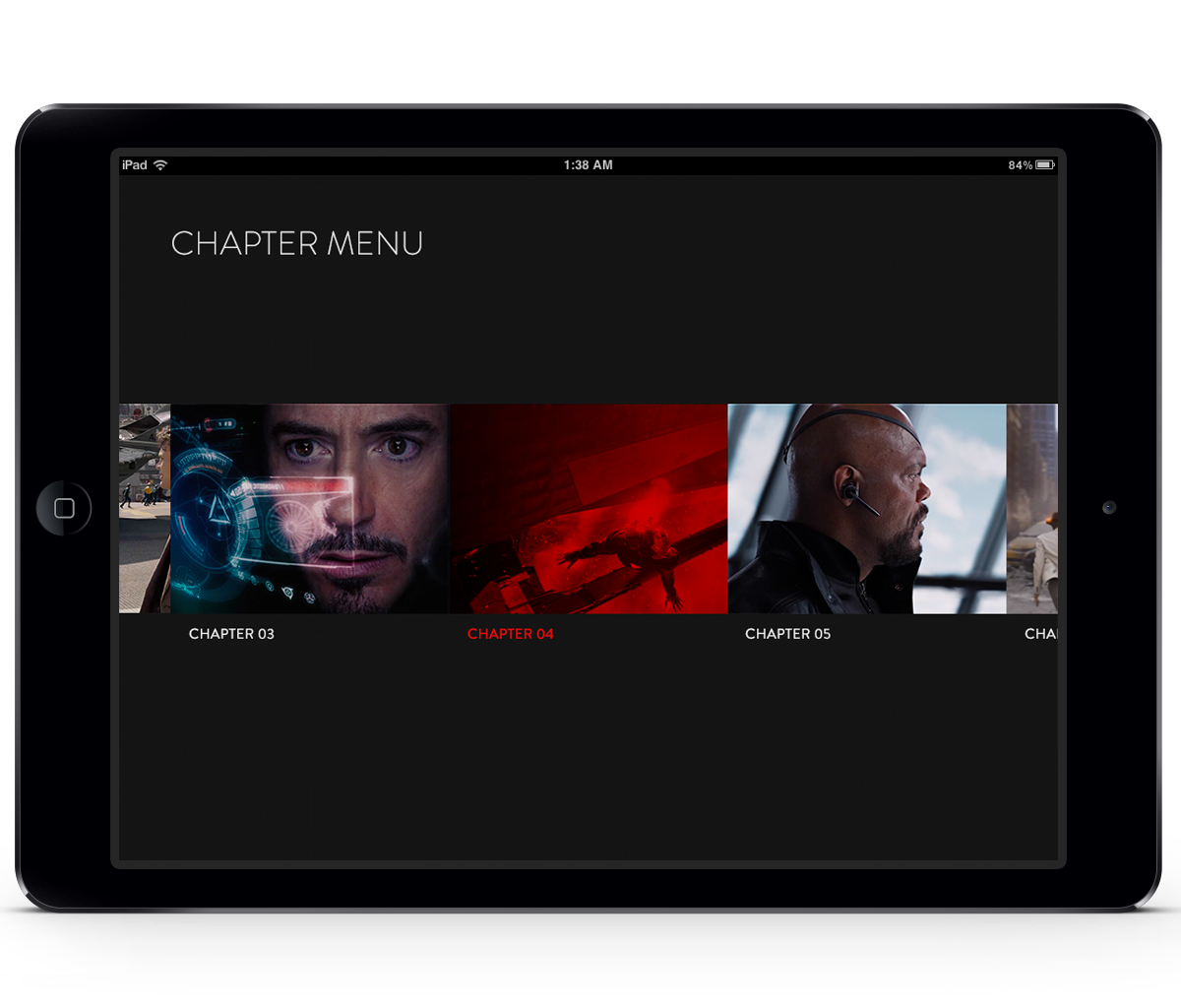
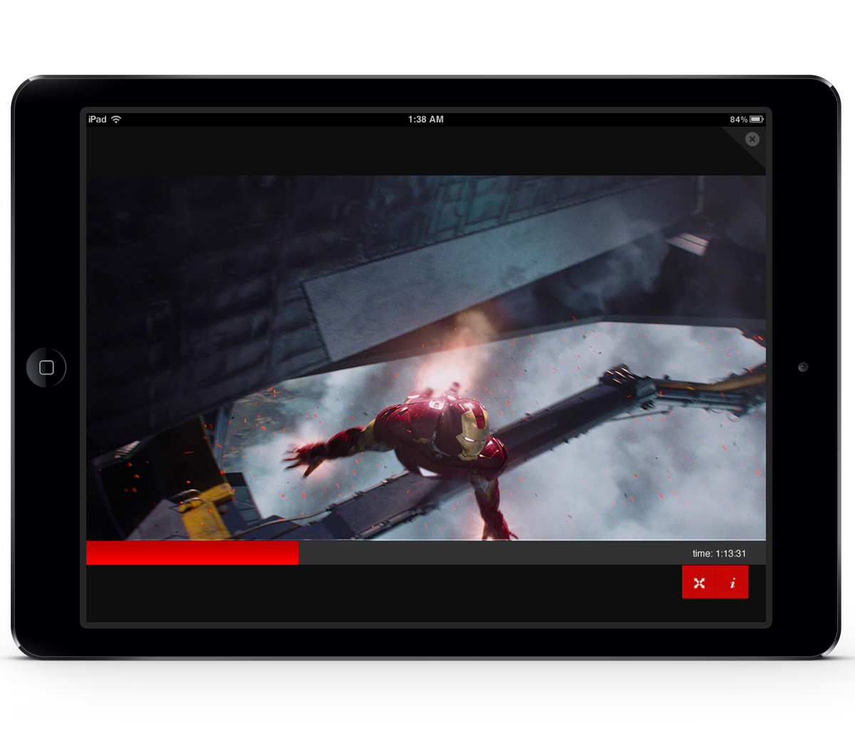
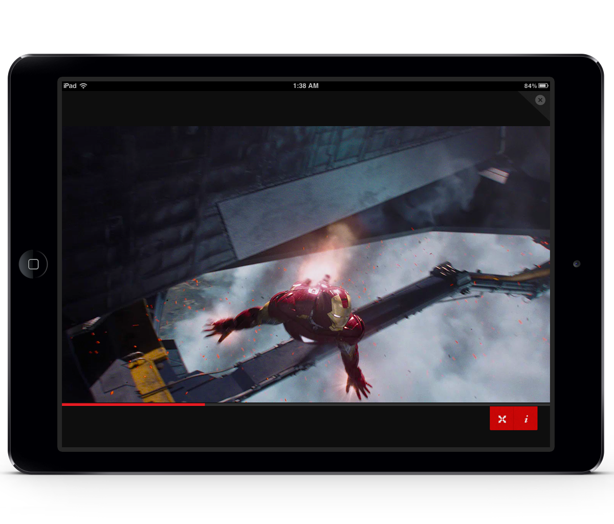
Netflix iPad Case study 2011
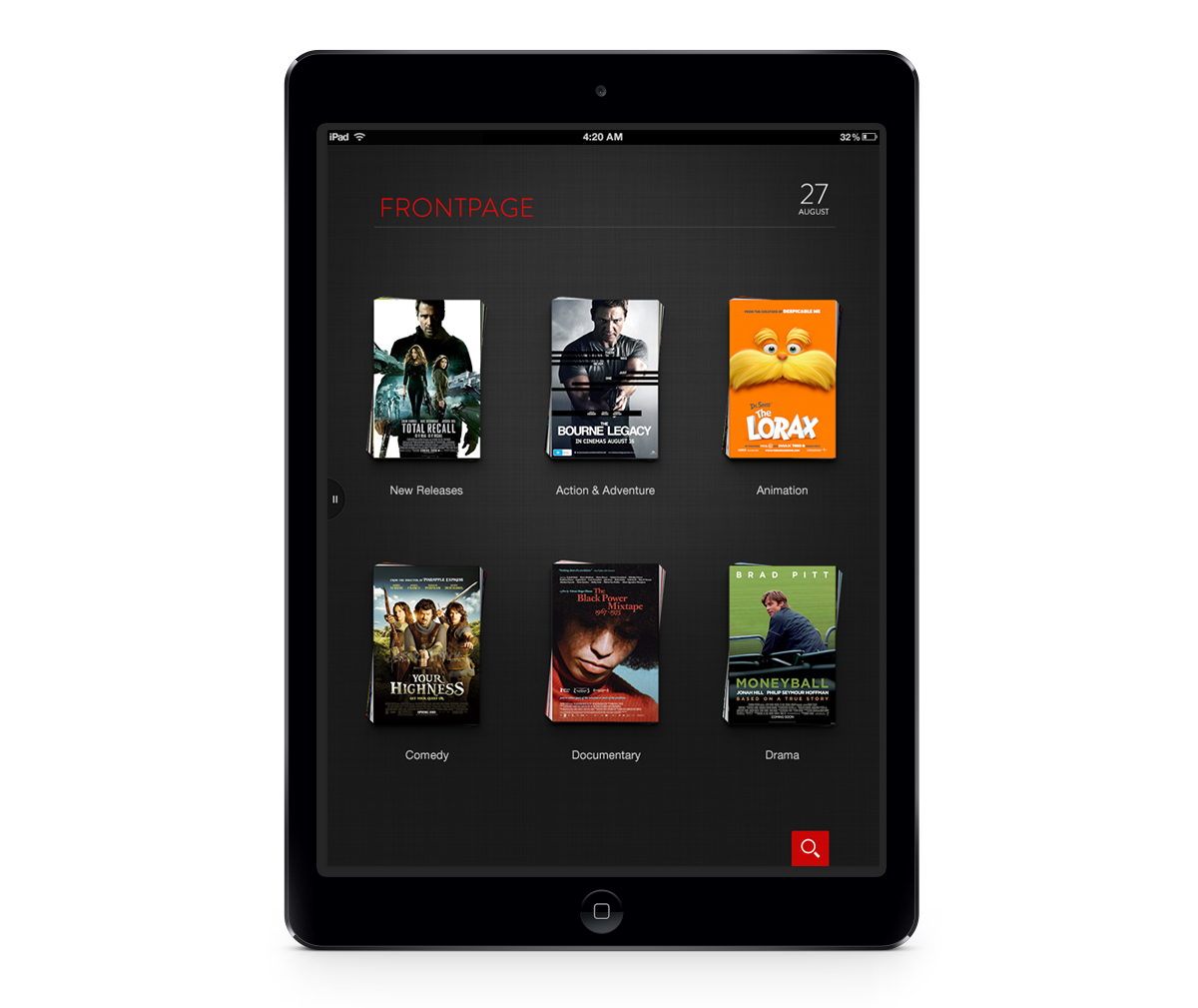
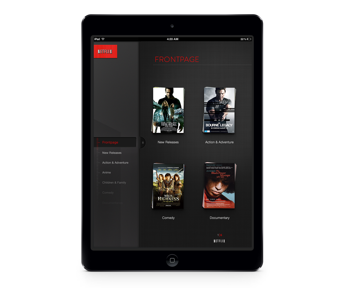
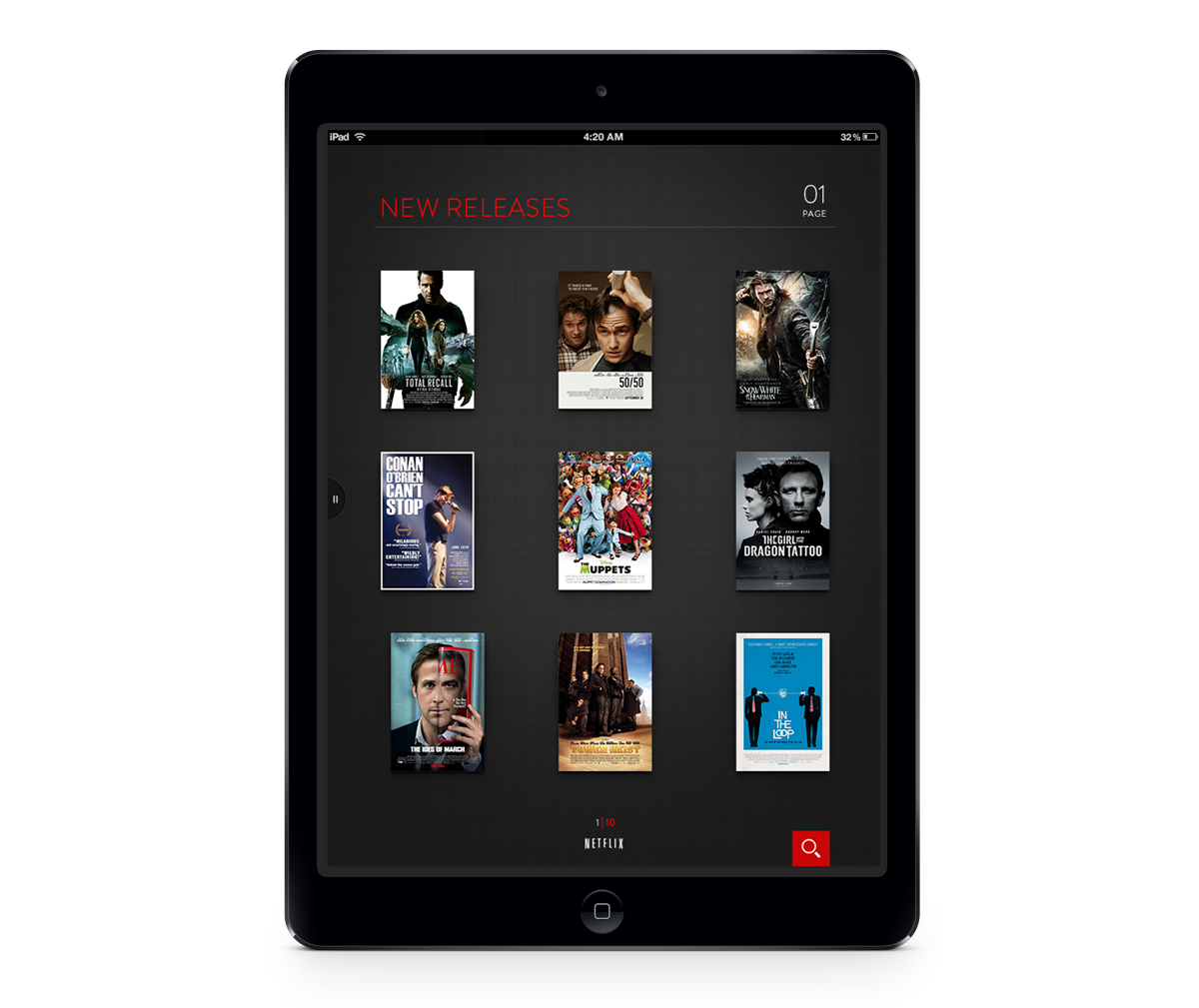
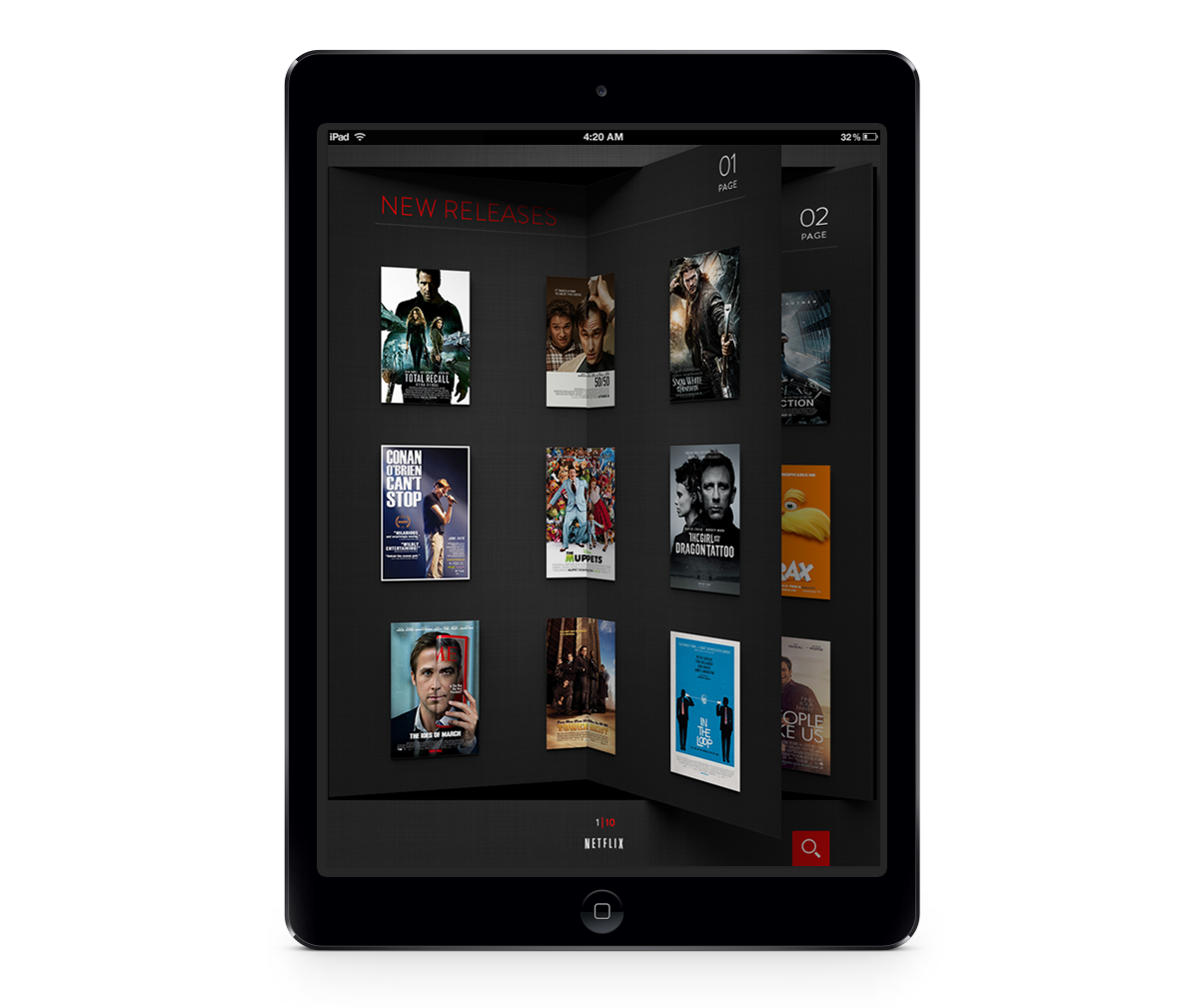
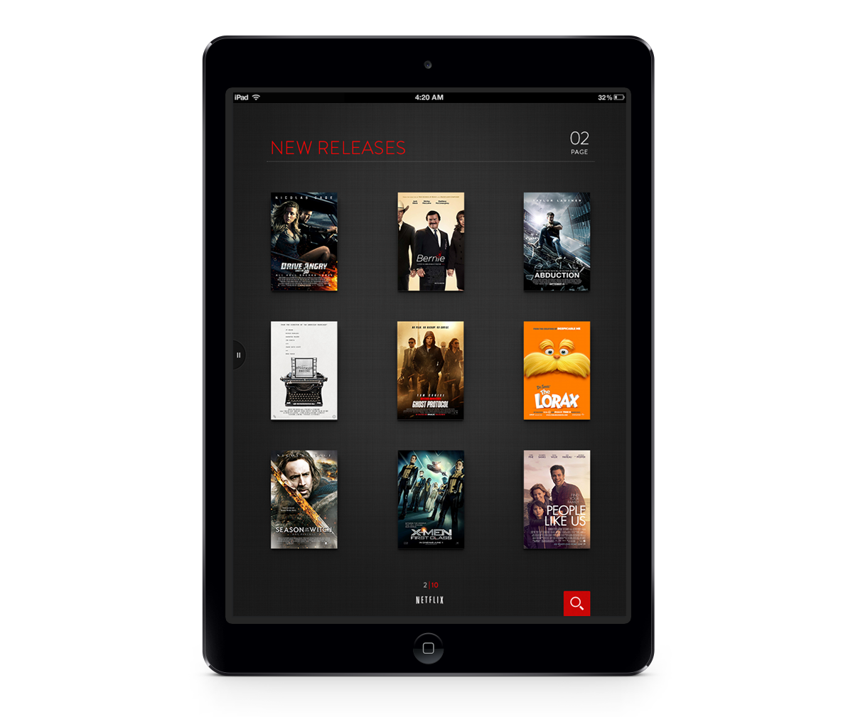
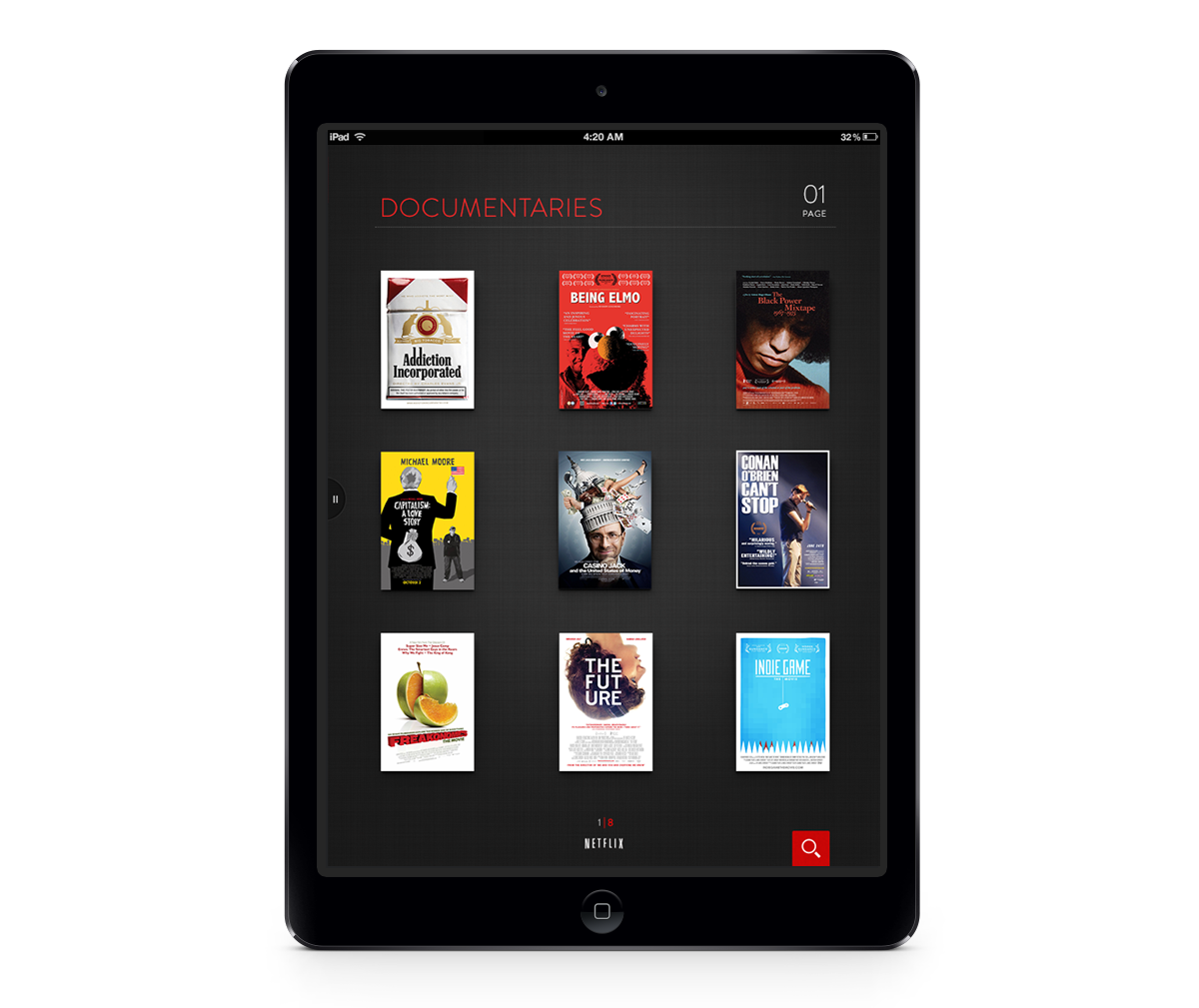
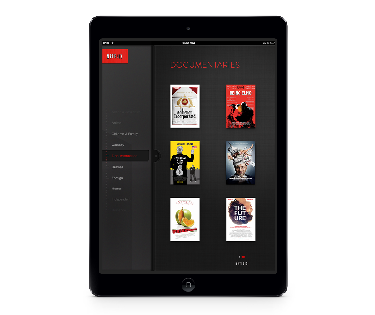
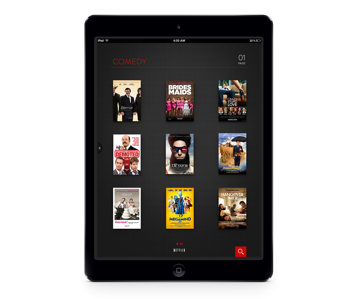
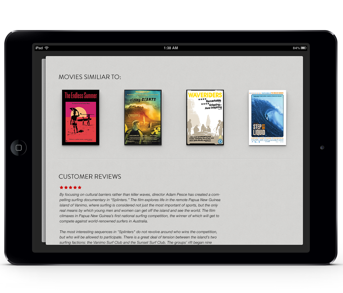
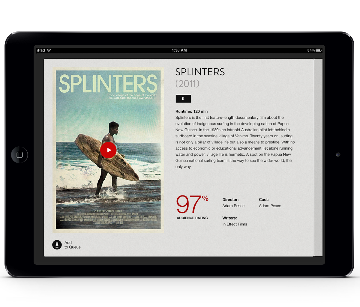
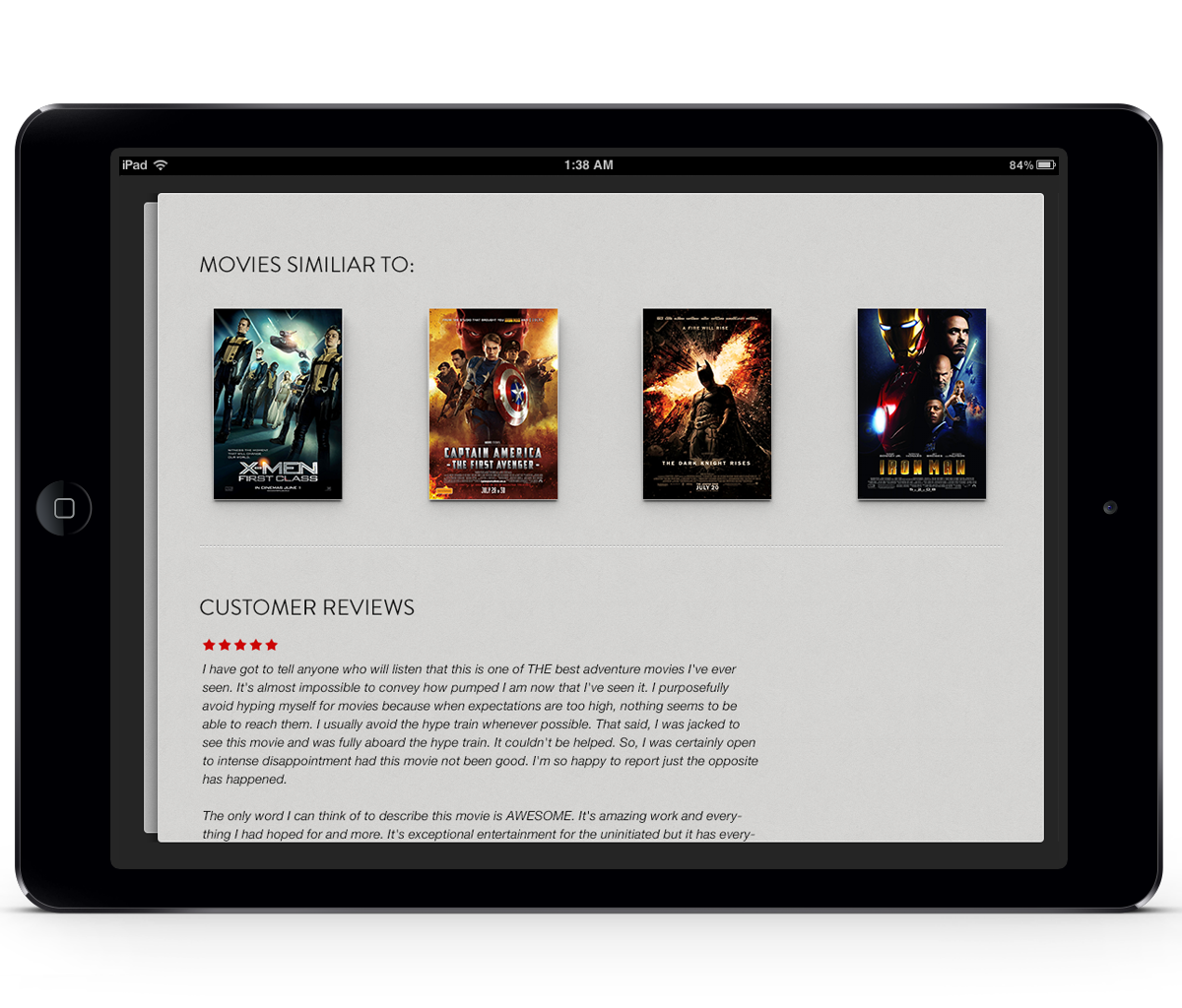
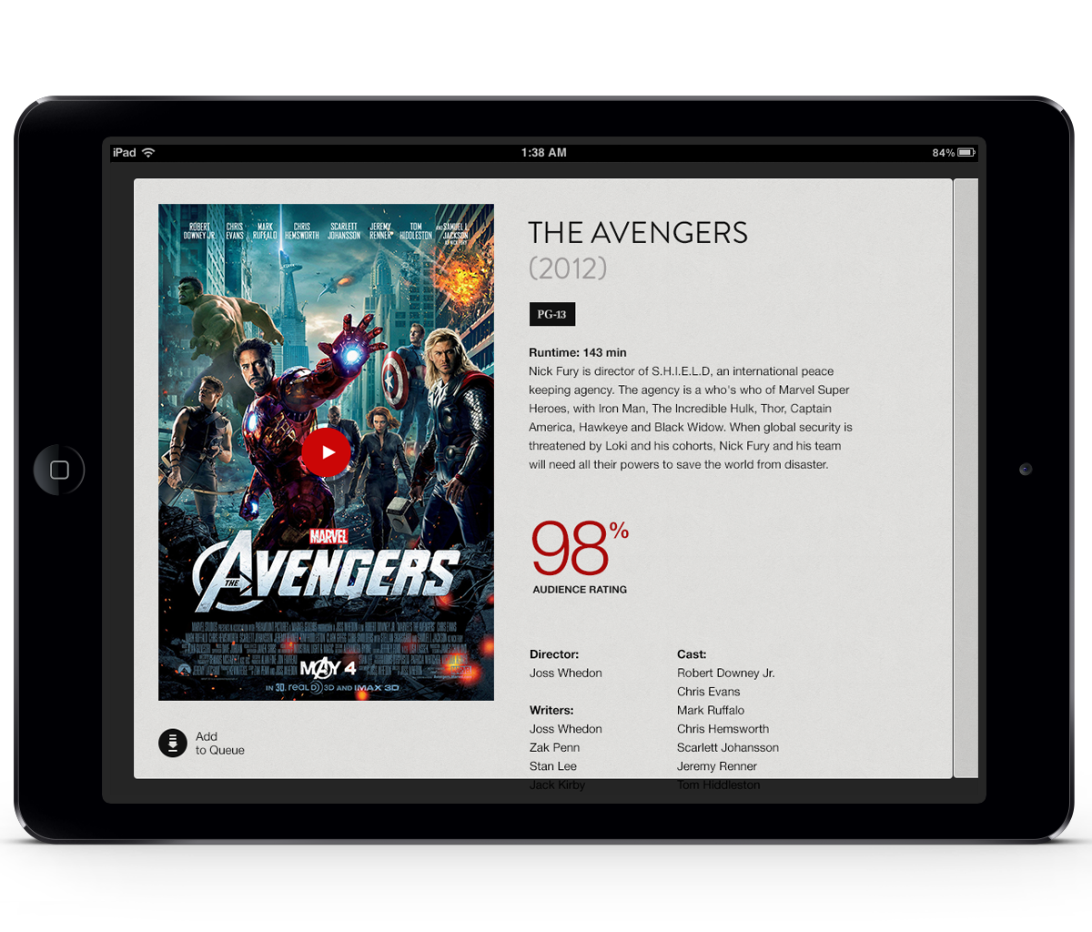
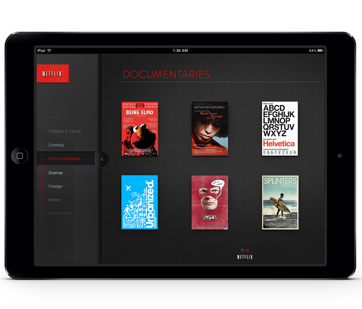
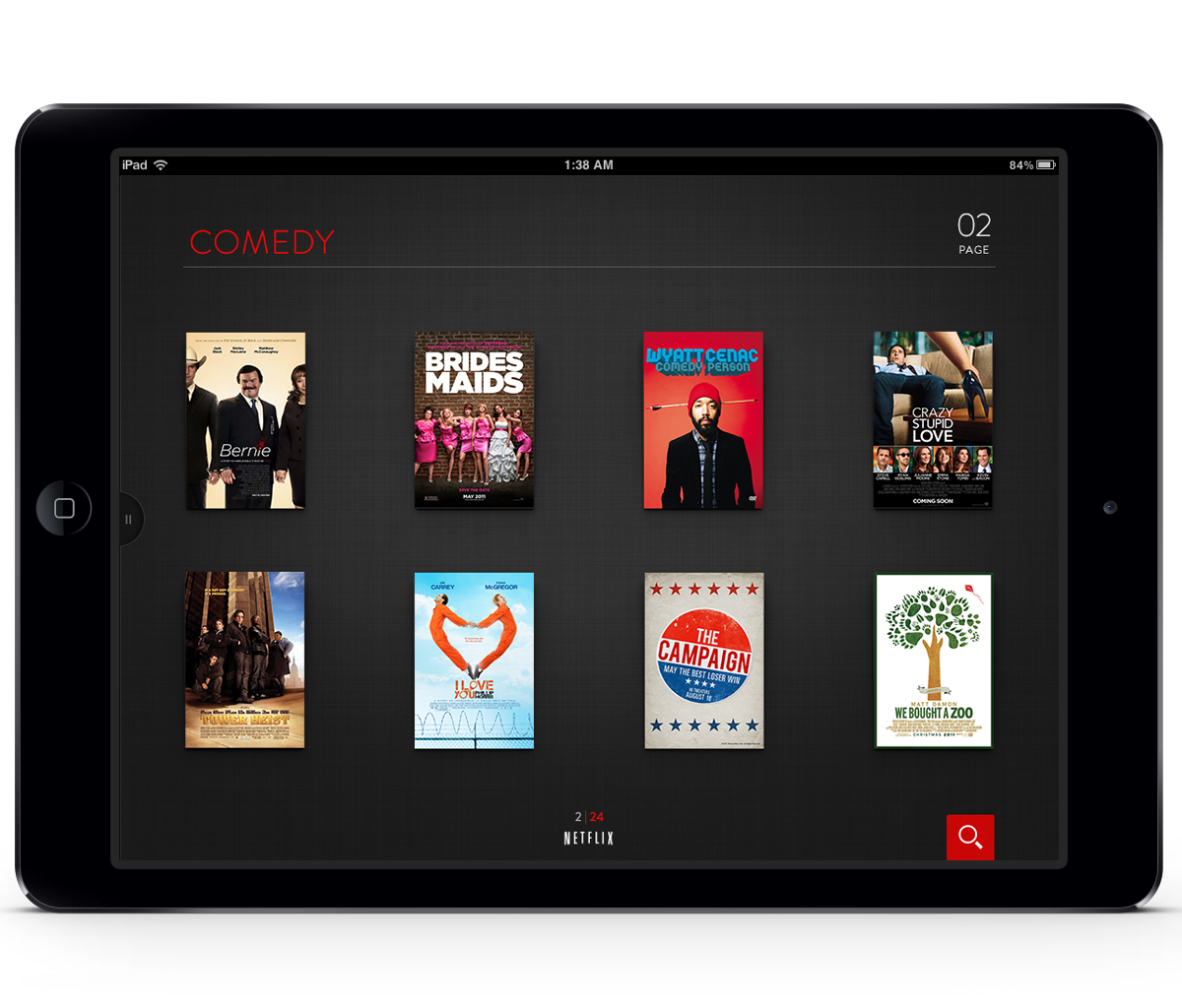
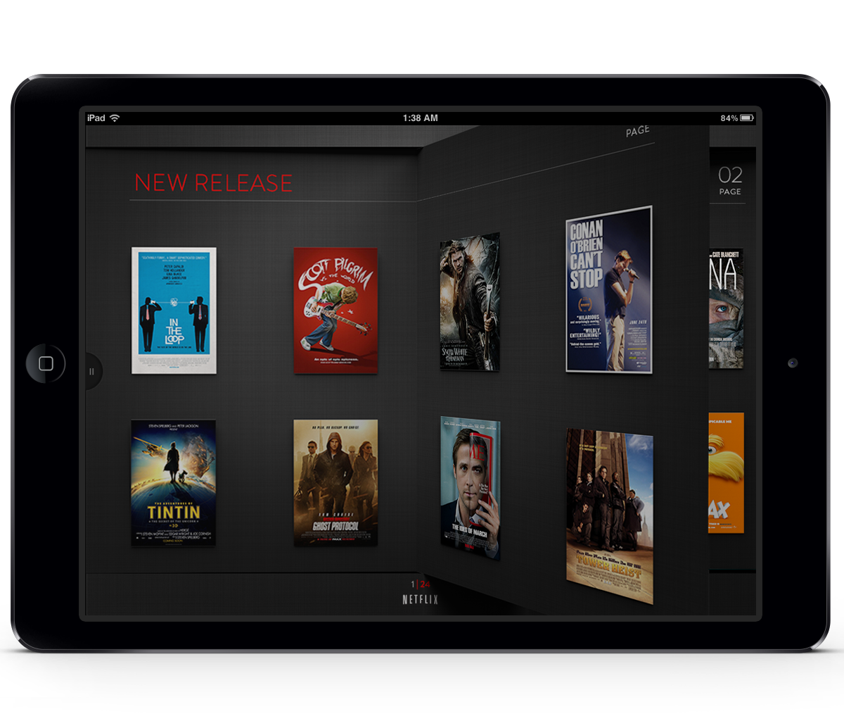
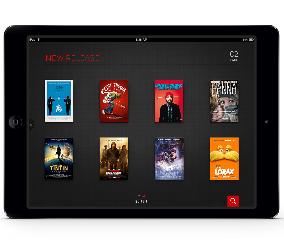
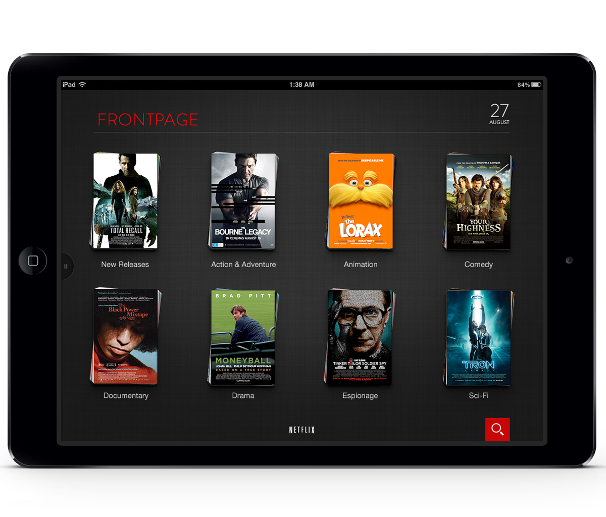
After a few days of using Netflix’s iPad app I was inspired to do a design refresh. Although very functional I just found the overall presentation of content a bit cluttered and I felt the hierarchy of the content could be much improved. For one, the carousels that bleed off the page where effective but there was no affordance giving the users an idea of the lengths of content per carousel. My goal with this design refresh was to strengthen the content’s hierarchy by employing better usage of negative space. Also presenting top-level categories up front in order to give the user a holistic view of what Netflix had to offer. Although, I am advocating an extra step to engaging in the content I believe this simplifies and makes the design clearer in intent. From an art direction stand point; the visual language takes much inspiration from film noir of the 40's and 50's. In addition this was a great exercise in typographic study. This case study was done in about 2.5 day period.