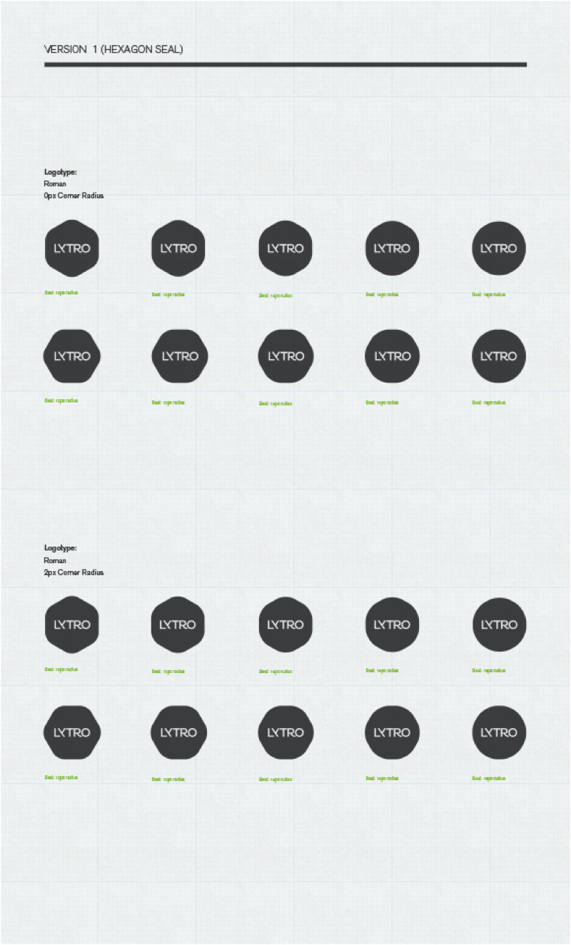
Lytro Identity 2012
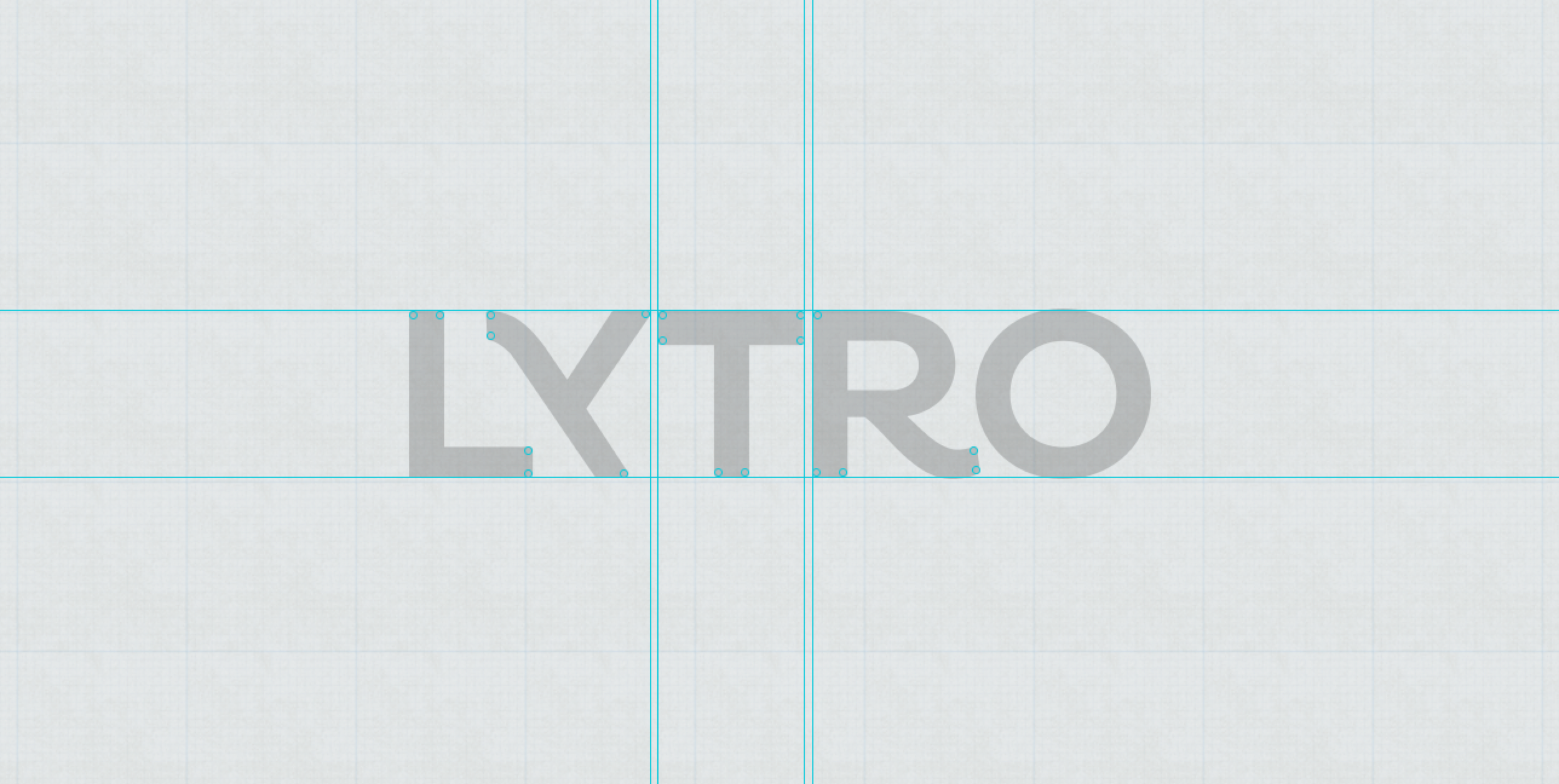
In 2012 I freelanced for a start-up called Lytro. One of the objectives I tackled was rethinking the Lytro logo mark. Below are final logo and rough design explorations. The logo adhered to a simple design philosophy we dubbed Elegant, Simple, Human. The logo aims to capture the elegance and beauty that’s inherent in classic photography. The nice nuance of the kick of the “R”, the stylized diagonal stroke of the descender in the “Y”, to the geometric form of the “O” all are nods to the past and aimed to evoke nostalgia.The san serif type gives the mark an air of modernity and order that is indicative in most tech companies. The subtle rounding of the corners offset the mark from becoming too rigid and imbuing it with an air of approachability. The reversing of the "Y" in the mark was done to achieve proper spacing and flow. The "LYT" lock up was problematic because it brought issues in the spacing between the letters. Also, by happenstance it brought a uniqueness to the mark that was easily memorable. The reversing of the "Y" was also a play of the lambda symbol which was a mathematical element responsible for the camera's underline technology. Was a subtle easter egg in the mark and a nice gesture to the engineering staff.

