Glow Identity & Branding Project


In 2020, I had the opportunity to work as a Freelance UX designer for Glow LLC, an IoT start-up based in Los Angeles. The company's focus was on creating communication devices for kids. My initial involvement with Glow LLC was to assist the founder, Ilya Pozin, with an investor deck. Additionally, part of my scope of work was to help establish the brand identity.
Collaborating closely with Ilya, we embarked on defining the brand's essence. Through numerous discussions, I gained insights into the brands he admired and his vision for Glow. From the start, Ilya had a strong inclination towards the name "Glow," as it embodied the metaphorical concept of self-actualization and connection that these devices would provide for children. The end result of using this product would be a metaphorical means for children to shine or glow.
To gain a better understanding of existing brand trends in the space, as well as adjacent tech brands of interest, I conducted a comprehensive competitive audit. This analysis helped us derive a clear direction to shape the Glow brand.


While Ilya was open to exploring alternative names related to "Glow," we eventually circled back to the original name. However, I encouraged him to consider a word-mark that struck a balance between being friendly and playful, yet suitably understated to reflect the technological nature of the devices. Considering that children are already exposed to brands like Apple and Google, a playful yet subtle identity would be more appropriate. Ilya and I were aligned in our pursuit of an understated mark, departing from the typical playful aesthetics often seen in standard toy brands.
Ultimately, we settled on a type specimen called Volte, a sans-serif geometric typeface that struck a pleasant balance between playfulness and understated elegance.
Early word-mark explorations


Creation of color palette
When establishing the brand's color palette, I created a series of mood boards capturing different tones such as friendly, vibrant, approachable, and monochromatic. After careful consideration, I fused elements from multiple mood boards to create a palette that embodied vibrancy and contrast, aligning with the desired tonality of the brand.
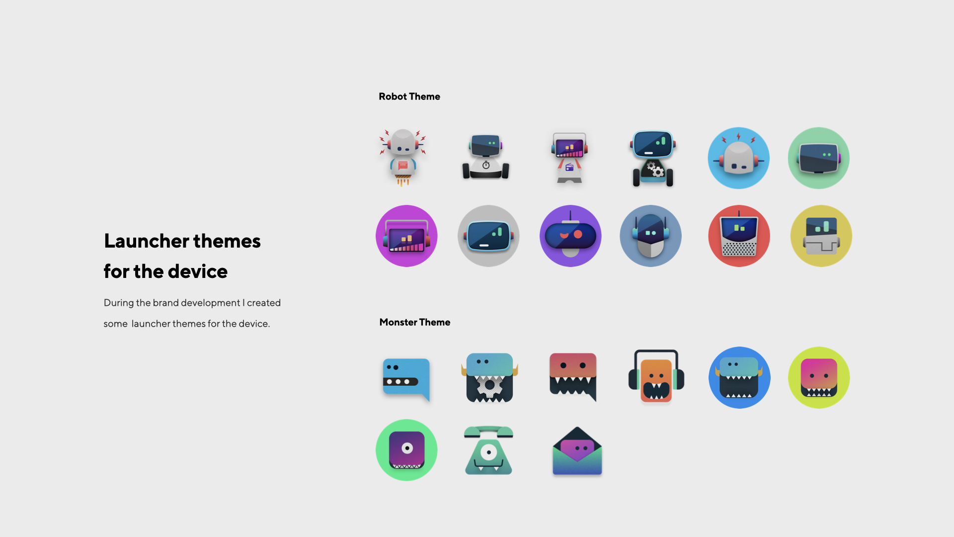
Once the color palette and typography were established, I applied the branding across various touch points, including the IoT devices launcher, the iOS mobile app, and the hardware itself. This ensured a consistent and cohesive brand experience for Glow LLC.
Overall, my collaboration with Ilya Pozin and the Glow LLC team allowed us to create a brand identity that captured the essence of the company's vision. The subtle yet friendly word-mark and vibrant color palette reflected the innovation and approach-ability of Glow's communication devices for kids, positioning the brand as a standout player in the IoT space.


Color Palette Explorations


Extending the brand